body.sv-lang-fr .ast-breadcrumbs-wrapper,body.sv-lang-fr .ast-breadcrumb-nav,body.sv-lang-fr .entry-header{display:none!important}
body.sv-lang-fr .entry-header{display:none}
body.sv-lang-fr .site-content,body.sv-lang-fr .site-content .ast-container,body.sv-lang-fr .site-content .content-area,body.sv-lang-fr #primary,body.sv-lang-fr .site-main,body.sv-lang-fr article,body.sv-lang-fr .entry-content{width:100%!important;max-width:none!important;margin:0!important;padding:0!important}
body.sv-lang-fr .site-content,body.sv-lang-fr .entry-content{padding-top:0!important;margin-top:0!important}
body.sv-lang-fr .entry-content>*{width:100%!important;max-width:none!important}
body.sv-lang-fr .site-header,body.sv-lang-fr #masthead,body.sv-lang-fr .site-footer,body.sv-lang-fr #colophon{display:none!important}
body.sv-lang-fr,body.sv-lang-fr #page,body.sv-lang-fr .site,body.sv-lang-fr .site-content{overflow-x:hidden}
body.sv-lang-fr #ht-ctc-chat{right:14px!important;bottom:14px!important}
.sv200{–dark:#0B1929;–deep:#050e1b;–blue:#1A365D;–orange:#FF6B35;–soft:#F5F7FA;–ink:#102235;–muted:#5f7084;–line:#dbe5ef;font-family:Inter,”Plus Jakarta Sans”,system-ui,-apple-system,BlinkMacSystemFont,”Segoe UI”,sans-serif;color:var(–ink);background:#fff}
.sv200 *{box-sizing:border-box}
.sv200{width:100vw!important;max-width:100vw!important;margin-left:calc(50% – 50vw)!important;margin-right:calc(50% – 50vw)!important;overflow-x:hidden}
.sv200 a{color:inherit;text-decoration:none!important}
.sv200 img{display:block;max-width:100%}
.sv200-wrap,.sv-home3-container{width:100%;max-width:1200px;margin:0 auto;padding:0 40px}
.sv200-section{padding:78px 0}
.sv200-soft{background:var(–soft)}
.sv200-kicker{display:inline-flex;align-items:center;margin:0 0 12px;padding:7px 11px;border-radius:999px;background:rgba(255,107,53,.12);color:var(–orange);font-size:11px;font-weight:900;letter-spacing:.08em;text-transform:uppercase}
.sv200 h1,.sv200 h2,.sv200 h3,.sv200 p{max-width:100%;overflow-wrap:break-word}
.sv200 h1,.sv200 h2,.sv200 h3{margin:0;color:var(–ink);letter-spacing:0;line-height:1.08}
.sv200 h1{max-width:590px;color:#fff;font-size:clamp(38px,3.35vw,46px)}
.sv200 h2{font-size:clamp(30px,3vw,44px);text-align:center}
.sv200 h3{font-size:20px}
.sv200 p{margin:0;color:var(–muted);font-size:16px;line-height:1.68}
.sv200-section-head{max-width:820px;margin:0 auto 36px;text-align:center}
.sv200-section-head p{margin-top:12px}
/* Homepage-standard header/footer subset */
.sv-home3-header{–dark:#0A2540;–navy:#1A365D;–orange:#F97316;–text:#10243f;–muted:#5f6f84;–line:#dbe5ef;position:sticky;top:0;z-index:20;border-bottom:1px solid #e7eef6;background:rgba(255,255,255,.96);backdrop-filter:blur(14px);font-family:Manrope,Arial,sans-serif}
.sv-home3-nav{display:flex;min-height:76px;align-items:center;justify-content:space-between;gap:28px}
.sv-home3-logo{display:inline-flex;align-items:center;flex:0 0 auto;width:174px;height:42px;line-height:0}
.sv-home3-logo-img{display:block;width:174px;height:42px;object-fit:contain;object-position:left center}
.sv-home3-menu{display:flex;align-items:center;gap:26px;color:#203650;font-size:13px;font-weight:700}
.sv-home3-menu a,.sv-home3-nav-link{transition:color .16s easewhite-space:nowrap}
.sv-home3-menu a:hover,.sv-home3-nav-link:hover{color:var(–orange)}
.sv-home3-nav-item{position:relative}
.sv-home3-nav-link{display:inline-flex;min-height:76px;align-items:center;gap:7px;color:#203650white-space:nowrap}
.sv-home3-nav-arrow{width:13px;height:13px;transition:transform .16s ease}
.sv-home3-submenu{position:absolute;top:100%;left:-12px;z-index:55;display:grid;min-width:258px;gap:3px;padding:10px;border:1px solid #dbe5ef;border-radius:8px;background:#fff;box-shadow:0 18px 42px rgba(10,37,64,.16);opacity:0;visibility:hidden;transform:translateY(8px);transition:opacity .16s ease,transform .16s ease,visibility .16s ease}
.sv-home3-nav-item:hover .sv-home3-submenu,.sv-home3-nav-item:focus-within .sv-home3-submenu{opacity:1;visibility:visible;transform:translateY(0)}
.sv-home3-nav-item:hover .sv-home3-nav-arrow,.sv-home3-nav-item:focus-within .sv-home3-nav-arrow{transform:rotate(180deg)}
.sv-home3-submenu a{display:block;padding:10px 12px;border-radius:6px;color:var(–dark);font-size:13px;line-height:1.24;white-space:nowrap}
.sv-home3-submenu a:hover{background:#f3f7fb}
.sv-home3-btn{display:inline-flex;min-height:45px;align-items:center;justify-content:center;gap:10px;padding:0 20px;border:1px solid transparent;border-radius:6px;font-size:13px;font-weight:800;line-height:1;transition:transform .16s ease,box-shadow .16s ease,border-color .16s ease,background .16s ease,color .16s ease}
.sv-home3-btn:hover{transform:translateY(-2px)}
.sv-home3-btn-orange{color:#fff;background:var(–orange);box-shadow:0 14px 26px rgba(249,115,22,.28)}
.sv-home3-mobile-label,.sv-home3-mobile-menu-toggle,.sv-home3-mobile-menu-trigger,.sv-home3-mobile-menu-panel{display:none}
.sv-home3-mobile-menu-toggle{position:absolute;width:1px;height:1px;opacity:0;pointer-events:none}
.sv-home3-footer{padding:34px 0 20px;color:rgba(255,255,255,.72);background:linear-gradient(135deg,#061a2f 0%,#092a4a 100%)}
.sv-home3-footer-grid{display:grid;grid-template-columns:repeat(4,minmax(0,1fr)) minmax(230px,1.05fr);gap:28px;align-items:start}
.sv-home3-footer h3{margin:0 0 12px;color:#fff;font-size:12px;font-weight:800;letter-spacing:.07em;text-transform:uppercase}
.sv-home3-footer a{display:block;padding:4px 0;color:rgba(255,255,255,.68);font-size:13px}
.sv-home3-footer a:hover{color:#fff}
.sv-home3-footer-contact p,.sv-home3-footer-contact span{display:block;margin:0 0 8px;color:rgba(255,255,255,.72);font-size:13px;line-height:1.55}
.sv-home3-footer-contact .sv-home3-footer-email{color:#fff;font-weight:800}
.sv-home3-footer-contact .sv-home3-footer-cta{display:inline-flex;align-items:center;justify-content:center;width:100%;min-height:38px;margin-top:10px;padding:0 14px;border:1px solid rgba(255,255,255,.32);border-radius:5px;color:#fff;font-size:12px;font-weight:800}
.sv-home3-footer-bottom{display:flex;align-items:center;justify-content:space-between;gap:20px;margin-top:36px;padding-top:22px;border-top:1px solid rgba(255,255,255,.12);font-size:13px}
.sv-home3-footer-logo{display:inline-flex;align-items:center}
.sv-home3-footer-logo img{display:block;width:150px;height:auto}
.sv-home3-footer-legal{display:inline-flex;align-items:center;gap:24px;flex-wrap:wrap}
.sv-home3-footer-legal a{display:inline-flex;padding:0}
.sv200-hero{position:relative;height:610px;min-height:610px;overflow:hidden;background:radial-gradient(circle at 70% 42%,rgba(26,54,93,.46),rgba(5,14,27,0) 42%),linear-gradient(135deg,#050e1b 0%,#071322 52%,#050e1b 100%)}
.sv200-hero .sv200-wrap{max-width:1320px;padding:0 40px}
.sv200-hero-media{display:none}
.sv200-hero-media img{position:absolute;inset:0;width:100%;height:100%;object-fit:cover;object-position:center right}
.sv200-hero:before{content:””;position:absolute;inset:0;z-index:1;background:linear-gradient(90deg,rgba(5,14,27,.99) 0%,rgba(5,14,27,.94) 34%,rgba(5,14,27,.36) 63%,rgba(5,14,27,.12) 100%)}
.sv200-hero:after{content:””;position:absolute;inset:0;z-index:1;background:linear-gradient(180deg,rgba(5,14,27,.02) 0%,rgba(5,14,27,.20) 100%);pointer-events:none}
.sv200-hero-inner{position:relative;z-index:2;display:grid;grid-template-columns:minmax(0,590px) minmax(300px,430px);align-items:center;justify-content:start;height:100%;min-height:0;gap:clamp(112px,10vw,150px);padding-top:42px;padding-bottom:48px}
.sv200-breadcrumb{margin:0 0 18px;color:rgba(255,255,255,.68);font-size:12px}
.sv200-breadcrumb a{color:rgba(255,255,255,.88)}
.sv200-hero-copy{max-width:590px}
.sv200-hero-copy>p:not(.sv200-breadcrumb){max-width:535px;margin-top:18px;color:#c8d3df;font-size:16px;line-height:1.62}
.sv200-stats{display:grid;grid-template-columns:repeat(4,minmax(0,1fr));gap:10px;max-width:535px;margin-top:30px}
.sv200-stat{display:flex;min-height:92px;flex-direction:column;align-items:center;justify-content:center;padding:9px 13px;border:1px solid rgba(255,255,255,.17);border-radius:8px;background:rgba(255,255,255,.08);text-align:center;backdrop-filter:blur(10px)}
.sv200-stat-icon{width:29px;height:29px;margin:0 0 6px;object-fit:contain;opacity:.96}
.sv200-stat strong{display:block;color:#fff;font-size:20px;line-height:1;white-space:nowrap}
.sv200-stat span{display:block;margin-top:7px;color:#c7d3df;font-size:11px;font-weight:900;text-transform:uppercase;letter-spacing:.05em}
.sv200-btnrow{display:flex;flex-wrap:wrap;gap:14px;margin-top:30px}
.sv200-btn{display:inline-flex;min-height:52px;align-items:center;justify-content:center;gap:10px;padding:0 22px;border:1px solid transparent;border-radius:8px;font-size:14px;font-weight:900}
.sv200-btn–orange{color:#fff;background:var(–orange);box-shadow:0 18px 38px rgba(255,107,53,.28)}
.sv200-btn–outline{color:#fff;border-color:rgba(255,255,255,.42);background:rgba(255,255,255,.04)}
.sv200 a.sv200-btn–orange,.sv200 a.sv200-btn–outline{color:#fff}
.sv200-hero-product{display:flex;align-items:center;justify-content:flex-start;min-width:0}
.sv200-hero-product img{width:auto;max-width:100%;max-height:520px;object-fit:contain;filter:drop-shadow(0 24px 44px rgba(0,0,0,.28))}
.sv200-basics{padding:42px 0 40px;background:#fff}
.sv200-basics .sv200-wrap{max-width:1360px}
.sv200-basics .sv200-section-head{max-width:920px;margin-bottom:22px}
.sv200-basics .sv200-kicker{padding:6px 12px;background:#fff0e8;color:var(–orange);font-size:10px;letter-spacing:.07em}
.sv200-basics h2{margin-top:8px;font-size:clamp(24px,1.9vw,30px);line-height:1.15}
.sv200-card-grid{display:grid;grid-template-columns:repeat(3,minmax(0,1fr));gap:18px;max-width:1160px;margin:0 auto;min-width:0}
.sv200-info-card{position:relative;display:block;min-height:154px;padding:0;border:1px solid #dfe8f2;border-radius:8px;background:#fff;box-shadow:0 10px 30px rgba(26,54,93,.055)}
.sv200-info-card>div{position:absolute;left:100px;top:32px;right:30px;min-width:0;padding:0}
.sv200-info-card img{position:absolute;left:31px;top:34px;display:block;width:48px;height:48px;border-radius:8px;object-fit:contain}
.sv200-info-card h3{margin:0 0 8px;font-size:15px;line-height:1.2;font-weight:900}
.sv200-info-card p{max-width:255px;margin:0;font-size:12.5px;line-height:1.56;overflow-wrap:break-word}
.sv200-specs{background:#fff}
.sv200-specs .sv200-wrap{max-width:1180px}
.sv200-specs .sv200-section-head{max-width:none;margin:0 0 24px;text-align:left}
.sv200-specs .sv200-kicker{margin:0 0 10px;padding:0;border-radius:0;background:transparent;color:var(–orange);font-size:11px;letter-spacing:.08em}
.sv200-specs h2{text-align:left;font-size:clamp(30px,2.55vw,38px);line-height:1.12}
.sv200-spec-layout{display:grid;grid-template-columns:minmax(0,.96fr) minmax(420px,1.04fr);gap:58px;align-items:start}
.sv200-spec-table,.sv200-compare-table{width:100%;border-collapse:collapse}
.sv200-matrix{padding:78px 0;background:#f8fafc;border-top:1px solid var(–line)}
.sv200-matrix-grid{display:grid;grid-template-columns:repeat(4,minmax(0,1fr));gap:22px;max-width:1240px;margin:36px auto 0}
.sv200-matrix-card{position:relative;display:flex;flex-direction:column;min-height:480px;border:1px solid var(–line);border-radius:10px;background:#fff;overflow:hidden;box-shadow:0 18px 44px rgba(26,54,93,.07);transition:transform .18s ease,box-shadow .18s ease}
.sv200-matrix-card:hover{transform:translateY(-4px);box-shadow:0 26px 56px rgba(26,54,93,.14)}
.sv200-matrix-card.is-current{border:2px solid #F97316;box-shadow:0 22px 50px rgba(249,115,22,.16)}
.sv200-matrix-badge{position:absolute;top:14px;right:14px;padding:5px 12px;border-radius:999px;background:#F97316;color:#fff;font-size:10.5px;font-weight:900;letter-spacing:.06em;text-transform:uppercase;z-index:2}
.sv200-matrix-media{display:grid;min-height:200px;place-items:center;background:linear-gradient(180deg,#fff,#f5f8fb)}
.sv200-matrix-media img{max-width:78%;max-height:180px;object-fit:contain}
.sv200-matrix-body{display:flex;flex:1;flex-direction:column;padding:22px 24px}
.sv200-matrix-body h3{margin:0 0 8px;font-size:17px;font-weight:900;color:#0A2540}
.sv200-matrix-body .sv200-matrix-spec{display:block;margin:0 0 16px;color:#1A365D;font-size:21px;font-weight:900;letter-spacing:-.01em}
.sv200-matrix-body ul{display:grid;gap:8px;margin:0 0 18px;padding:0;list-style:none;color:#506276;font-size:13px;line-height:1.45}
.sv200-matrix-body li:before{content:””;display:inline-block;width:5px;height:5px;margin-right:8px;border-radius:50%;background:#F97316;vertical-align:middle}
.sv200-matrix-link{margin-top:auto;color:#F97316;font-size:13.5px;font-weight:900;text-decoration:none}
.sv200-matrix-link:hover{color:#EA580C}
.sv200-matrix-link.is-current{color:#506276;cursor:default;pointer-events:none}
@media (max-width:1080px){.sv200-matrix-grid{grid-template-columns:repeat(2,minmax(0,1fr))}}
@media (max-width:600px){.sv200-matrix-grid{grid-template-columns:1fr;max-width:520px}}
.sv200-table-card,.sv200-dim-card,.sv200-compare-wrap{overflow:hidden;border:1px solid var(–line);border-radius:8px;background:#fff;box-shadow:0 18px 44px rgba(26,54,93,.07)}
.sv200-specs .sv200-table-card{border-radius:6px;box-shadow:none}
.sv200-spec-table th,.sv200-spec-table td,.sv200-compare-table th,.sv200-compare-table td{padding:14px 16px;border-bottom:1px solid var(–line);font-size:14px;text-align:left;vertical-align:top}
.sv200-specs .sv200-spec-table th,.sv200-specs .sv200-spec-table td{padding:11px 14px;font-size:13px;line-height:1.35}
.sv200-spec-table th{width:38%;color:#102235;background:#f8fafc;font-weight:900}
.sv200-spec-table td{color:#45586d}
.sv200-spec-table tr:last-child th,.sv200-spec-table tr:last-child td,.sv200-compare-table tr:last-child td{border-bottom:0}
.sv200-dim-card{display:grid;min-height:100%;place-items:center;padding:28px}
.sv200-specs .sv200-dim-card{display:block;min-height:auto;padding:0;border:0;border-radius:0;background:transparent;box-shadow:none;overflow:visible}
.sv200-dim-stage{position:relative;width:min(100%,520px);min-height:470px;display:grid;place-items:center}
.sv200-specs .sv200-dim-stage{display:block;width:100%;min-height:0}
.sv200-dim-stage img{max-width:72%;max-height:390px;object-fit:contain}
.sv200-specs .sv200-dim-stage img{width:100%;max-width:530px;max-height:none;margin:0 auto;object-fit:contain}
.sv200-dim-label{position:absolute;display:inline-flex;align-items:center;justify-content:center;padding:5px 9px;border-radius:999px;color:#102235;background:#eef5fb;font-size:12px;font-weight:900;box-shadow:0 6px 14px rgba(26,54,93,.08)}
.sv200-dim-top{top:16px;left:50%;transform:translateX(-50%)}
.sv200-dim-left{left:0;top:50%;transform:translateY(-50%) rotate(-90deg)}
.sv200-dim-right{right:0;top:50%;transform:translateY(-50%) rotate(90deg)}
.sv200-dim-note{margin-top:14px;color:#5f7084;font-size:13px;text-align:center}
.sv200-specs .sv200-dim-note{display:none}
.sv200-compare-wrap{overflow:auto}
.sv200-compare-table{min-width:780px}
.sv200-compare-table th{color:#fff;background:#102235;font-weight:900;text-align:center}
.sv200-compare-table th:first-child,.sv200-compare-table td:first-child{text-align:left;font-weight:900}
.sv200-compare-table td{color:#45586d;text-align:center}
.sv200-compare-table tr:nth-child(even) td{background:#f8fafc}
.sv200-table-link{color:var(–orange)!important;font-weight:900}
.sv200-logos{display:grid;grid-template-columns:repeat(8,minmax(0,1fr));gap:10px;max-width:1220px;margin:26px auto 0}
.sv200-logo{display:flex;min-height:64px;align-items:center;justify-content:center;gap:8px;border:1px solid var(–line);border-radius:6px;background:#fff;color:#6f7882;filter:grayscale(1);box-shadow:0 10px 28px rgba(26,54,93,.045)}
.sv200-logo img{display:block;max-width:112px;max-height:34px;width:auto;height:auto;object-fit:contain;opacity:.82}
.sv200-logo span{display:inline-block;color:#6f7882;font-size:14px;font-weight:900;line-height:1}
.sv200-logo–wide img{max-width:122px;max-height:32px}
.sv200-logo–icon img{width:28px;height:28px}
.sv200-inverter-note{max-width:900px;margin:14px auto 0;color:#6d7c8f;font-size:12px;text-align:center}
.sv200-apps{display:grid;grid-template-columns:repeat(3,minmax(0,1fr));gap:24px}
.sv200-app{overflow:hidden;border:1px solid var(–line);border-radius:8px;background:#fff;box-shadow:0 18px 46px rgba(26,54,93,.08)}
.sv200-app img{width:100%;aspect-ratio:16/10;object-fit:cover}
.sv200-app-body{padding:24px}
.sv200-app h3{margin-bottom:10px}
.sv200-app p{font-size:14px;line-height:1.58}
.sv200-app span{display:inline-flex;margin-top:16px;color:var(–orange);font-size:14px;font-weight:900}
.sv200-trust{display:grid;grid-template-columns:repeat(4,minmax(0,1fr));gap:18px;max-width:1320px;margin:0 auto}
.sv200-trust-card{position:relative;display:block;min-height:146px;padding:0;border:1px solid var(–line);border-radius:8px;background:#fff;box-shadow:0 18px 44px rgba(26,54,93,.08)}
.sv200-trust-card img{position:absolute;left:28px;top:34px;width:46px;height:46px;border-radius:8px;object-fit:contain}
.sv200-trust-card>div{position:absolute;left:94px;top:32px;right:24px;min-width:0;padding:0}
.sv200-trust-card h3{margin:0 0 8px;font-size:14.5px;font-weight:900;line-height:1.18}
.sv200-trust-card p{max-width:185px;margin:0;font-size:12.5px;line-height:1.54;overflow-wrap:break-word}
.sv200-faq{background:var(–soft)}
.sv200-faq-list{max-width:1180px;margin:0 auto;display:grid;grid-template-columns:repeat(2,minmax(0,1fr));gap:12px 18px}
.sv200-faq details{border:1px solid var(–line);border-radius:8px;background:#fff}
.sv200-faq summary{display:flex;min-height:58px;align-items:center;justify-content:space-between;gap:18px;cursor:pointer;padding:0 22px;color:#102235;font-size:14px;font-weight:900;line-height:1.25;list-style:none}
.sv200-faq summary:after{content:”›”;flex:0 0 auto;color:#71839a;font-size:24px;font-weight:700;line-height:1;transition:transform .16s ease}
.sv200-faq details[open] summary:after{transform:rotate(90deg)}
.sv200-faq summary::-webkit-details-marker{display:none}
.sv200-faq details p{padding:0 22px 20px;font-size:14px;line-height:1.55}
.sv200-final{background:linear-gradient(135deg,#0B1929,#1A365D);text-align:center}
.sv200-final h2{color:#fff}
.sv200-final p{max-width:720px;margin:16px auto 0;color:#c9d5e1}
.sv200-final .sv200-btnrow{justify-content:center}
@media (max-width:1080px){
.sv-home3-menu{display:none!important}
.sv-home3-logo,.sv-home3-logo-img{width:124px;height:28px}
.sv-home3-header-quote{display:none!important}
.sv-home3-mobile-menu-trigger{position:static;z-index:42;display:flex!important;justify-self:end;align-self:center;width:auto;min-width:74px;height:34px;align-items:center;justify-content:center;gap:8px;padding:0 10px;border:1px solid var(–orange);border-radius:6px;background:var(–orange);cursor:pointer}
.sv-home3-mobile-menu-trigger b{color:#fff;font-size:12px;line-height:1;font-weight:900}
.sv-home3-mobile-menu-trigger i{display:flex;width:18px;flex-direction:column;gap:5px;font-style:normal}
.sv-home3-mobile-menu-trigger i span{display:block;width:18px;height:2px;border-radius:999px;background:#fff;transition:transform .16s ease,opacity .16s ease}
.sv-home3-mobile-menu-panel{position:absolute;z-index:41;top:calc(100% + 8px);left:0;right:0;width:100%;display:none;gap:8px;padding:12px;border:1px solid #dbe5ef;border-radius:8px;background:#fff;box-shadow:0 18px 40px rgba(10,37,64,.16);max-height:calc(100vh – 68px);overflow-y:auto}
.sv-home3-mobile-menu-toggle:checked~.sv-home3-mobile-menu-panel,.sv-home3-mobile-menu-panel:focus-within{display:grid}
.sv-home3-mobile-menu-toggle:checked+.sv-home3-mobile-menu-trigger i span:nth-child(1){transform:translateY(7px) rotate(45deg)}
.sv-home3-mobile-menu-toggle:checked+.sv-home3-mobile-menu-trigger i span:nth-child(2){opacity:0}
.sv-home3-mobile-menu-toggle:checked+.sv-home3-mobile-menu-trigger i span:nth-child(3){transform:translateY(-7px) rotate(-45deg)}
.sv-home3-mobile-menu-group{display:grid;gap:4px;padding:8px;border:1px solid #eef3f8;border-radius:8px;background:#f8fafc}
.sv-home3-mobile-menu-title{display:flex;align-items:center;justify-content:space-between;padding:0 4px 4px;color:var(–orange);font-size:11px;font-weight:900;letter-spacing:.08em;text-transform:uppercase}
.sv-home3-mobile-menu-panel a{display:flex;min-height:38px;align-items:center;padding:0 12px;border-radius:6px;color:var(–dark);font-size:14px;font-weight:800}
.sv-home3-mobile-menu-panel a:hover{background:#f3f7fb;color:var(–orange)}
.sv-home3-mobile-menu-panel .sv-home3-mobile-menu-cta{justify-content:center;margin-top:6px;color:#fff;background:var(–orange)}
.sv200-stats,.sv200-card-grid,.sv200-apps,.sv200-trust,.sv-home3-footer-grid{grid-template-columns:repeat(2,minmax(0,1fr))}
.sv200-card-grid{grid-template-columns:1fr;max-width:700px}
.sv200-spec-layout{grid-template-columns:1fr}
.sv200-logos{grid-template-columns:repeat(4,minmax(0,1fr))}
}
@media (max-width:768px){
body.sv-lang-fr #ht-ctc-chat{right:8px!important;bottom:8px!important;transform-origin:bottom right}
body.sv-lang-fr #ht-ctc-chat .ht_ctc_chat_style svg{width:40px!important;height:40px!important}
.sv200-wrap,.sv-home3-container{padding:0 24px}
.sv200-section{padding:54px 0}
.sv200-hero{height:auto;min-height:auto}
.sv200-hero-media{display:block}
.sv200-hero-media img{object-fit:cover;object-position:center top;opacity:.52}
.sv200-hero:before{background:linear-gradient(180deg,rgba(5,14,27,.98) 0%,rgba(5,14,27,.94) 54%,rgba(5,14,27,.82) 100%)}
.sv200-hero-inner{display:block;min-height:0;padding-top:34px;padding-bottom:58px}
.sv200-hero-product{display:none}
.sv200 h1{font-size:36px;line-height:1.08}
.sv200 h2{font-size:30px;line-height:1.12}
.sv200-hero-copy>p:not(.sv200-breadcrumb){font-size:15px}
.sv200-stats{grid-template-columns:repeat(2,minmax(0,1fr));max-width:none}
.sv200-btnrow{display:grid;grid-template-columns:1fr}
.sv200-btn{width:100%}
.sv200-card-grid,.sv200-apps,.sv200-trust,.sv200-faq-list,.sv-home3-footer-grid{grid-template-columns:1fr}
.sv200-info-card{min-height:154px}
.sv200-info-card>div{left:88px;top:28px;right:22px}
.sv200-info-card img{left:24px;top:31px;width:44px;height:44px}
.sv200-trust-card{min-height:146px}
.sv200-trust-card img{left:24px;top:31px;width:44px;height:44px}
.sv200-trust-card>div{left:88px;top:28px;right:22px}
.sv200-logos{grid-template-columns:repeat(2,minmax(0,1fr))}
.sv200-dim-stage{min-height:380px}
.sv200-specs .sv200-dim-stage{min-height:0}
.sv200-dim-stage img{max-height:310px}
.sv200-specs .sv200-dim-stage img{max-width:100%;max-height:none}
.sv-home3-footer-bottom{display:block}
.sv-home3-footer-logo{margin-bottom:16px}
.sv-home3-footer-legal{display:grid;gap:10px}
}
@media (max-width:480px){
.sv200{width:100%!important;max-width:100%!important;margin-left:0!important;margin-right:0!important}
.sv200-wrap,.sv-home3-container{padding:0 20px}
.sv200 h1{font-size:31px}
.sv200 h2{font-size:27px}
.sv200 p{font-size:15px}
.sv200-stat{min-height:90px;padding:9px 12px}
.sv200-stat-icon{width:27px;height:27px}
.sv200-stat strong{font-size:18px}
.sv200-stat span{font-size:10px}
.sv200-logos{grid-template-columns:1fr}
.sv200-dim-left{left:-18px}
.sv200-dim-right{right:-18px}
}
.sv200-calc-helper{display:flex;gap:18px;align-items:center;max-width:1100px;margin:36px auto;padding:22px 28px;border:1px solid rgba(249,115,22,.3);border-radius:12px;background:linear-gradient(135deg,rgba(249,115,22,.04),rgba(56,189,248,.04));box-shadow:0 14px 36px rgba(10,37,64,.06)}
.sv200-calc-helper-icon{flex:0 0 auto;width:52px;height:52px;display:flex;align-items:center;justify-content:center;border-radius:50%;background:rgba(249,115,22,.12);color:#F97316;font-size:26px}
.sv200-calc-helper-body{flex:1;min-width:0}
.sv200-calc-helper-body h3{margin:0 0 4px;font-size:17px;font-weight:900;color:#0A2540;line-height:1.3}
.sv200-calc-helper-body p{margin:0;color:#506276;font-size:14px;line-height:1.5}
.sv200-calc-helper-cta{flex:0 0 auto;display:inline-flex;align-items:center;padding:12px 20px;border-radius:8px;background:#F97316;color:#fff;font-size:13px;font-weight:900;text-decoration:none;white-space:nowrap;box-shadow:0 8px 20px rgba(249,115,22,.28)}
.sv200-calc-helper-cta:hover{background:#EA580C}
@media(max-width:780px){.sv200-calc-helper{flex-direction:column;text-align:center;gap:14px}}/* sv-mobile-448-v1 */
@media (max-width:900px){
body.sv-lang-fr .sv200-apps{grid-template-columns:1fr!important;gap:18px!important}
body.sv-lang-fr .sv200-trust{grid-template-columns:repeat(2,1fr)!important;gap:16px!important}
body.sv-lang-fr .sv200-section{padding:48px 0!important}
body.sv-lang-fr .sv200-section h2{font-size:27px!important}
}
@media (max-width:480px){
body.sv-lang-fr .sv200-trust{grid-template-columns:1fr!important}
}
ApplicationsOù les batteries de 200 Ah alimentent vos projets
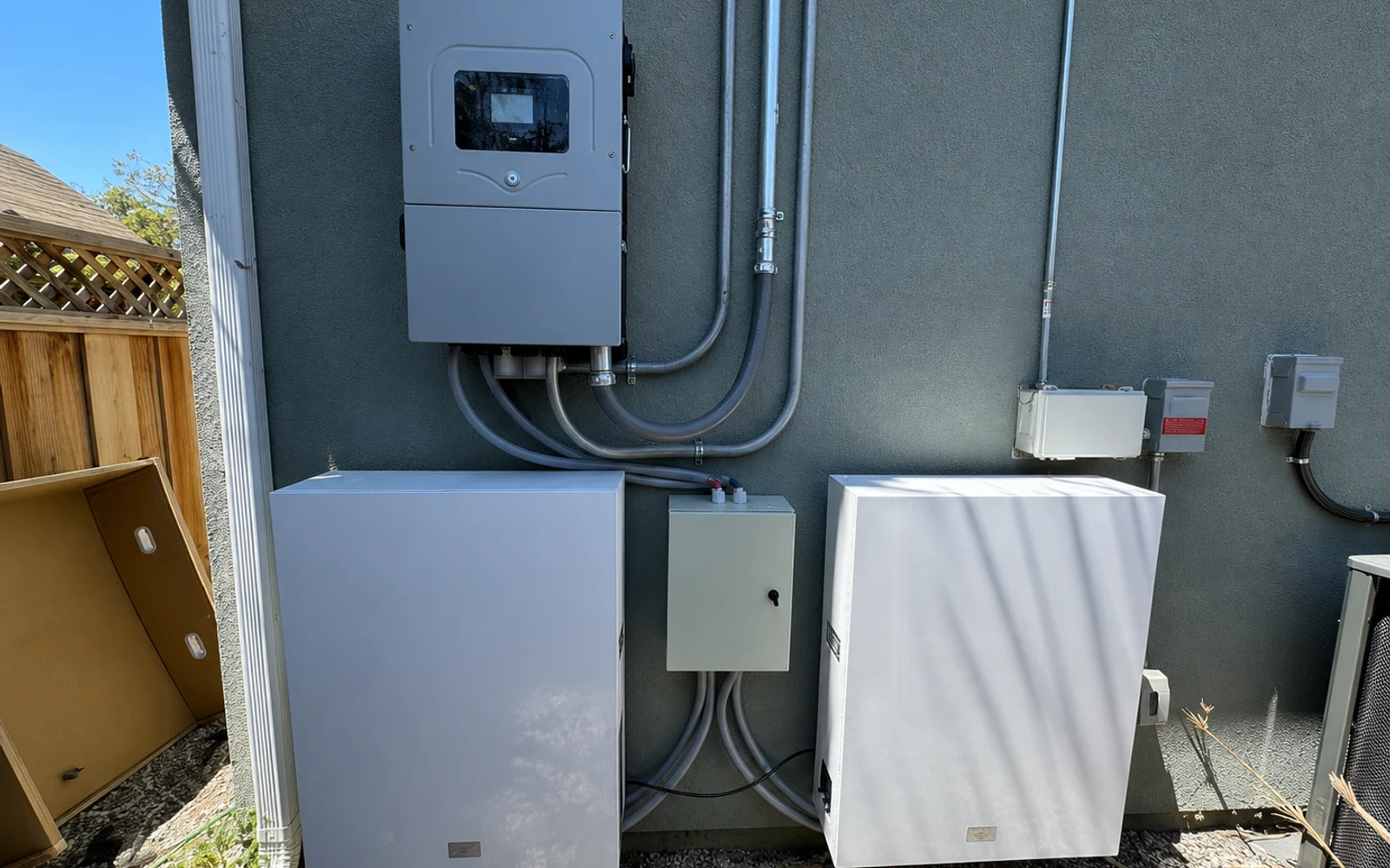
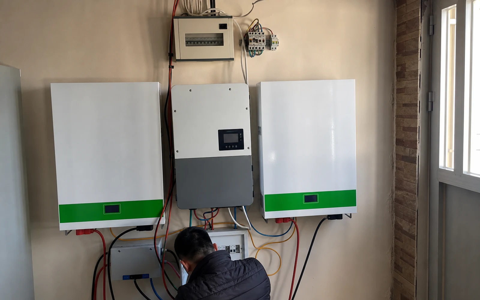
Que votre projet concerne une sauvegarde liée au réseau, un stockage hors réseau ou hybride, la décision en matière de catégorie d’onduleur façonne l’architecture du système. Consultez notre guide d’achat hybride, hors réseau ou lié au réseau pour connaître le cadre.
Gamme de produits
Comparez la gamme Savolture LFP
Même plate-forme LFP 48 V, quatre facteurs de forme : choisissez en fonction de la capacité (10 à 16 kWh) et de l’encombrement (mur, sol ou rack modulaire).
Vous êtes ici
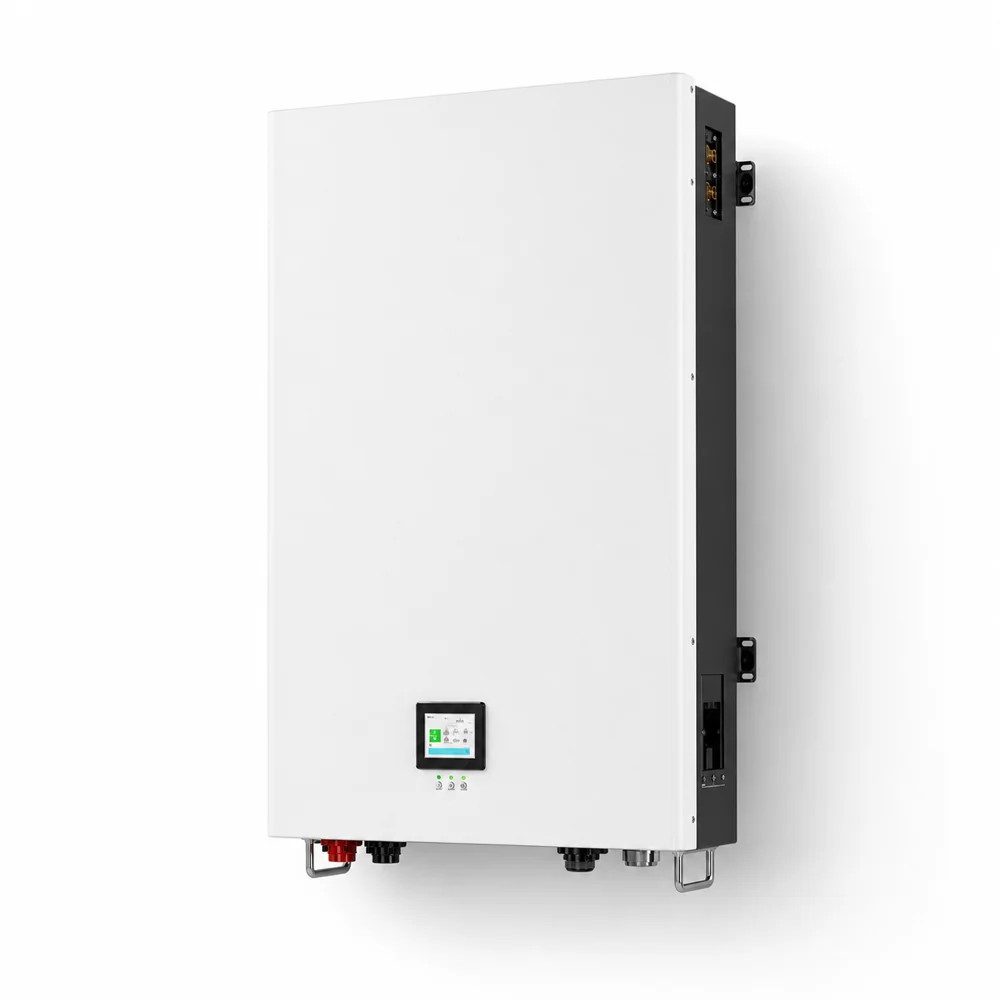
Mural
200 Ah · 10,24 kWh
- Options IP20/IP65
- 6 500 cycles
- Classe 84,5 kg
Configuration actuelle
Mural
280 Ah · 14,34 kWh
- Chemin d’accès au système répertorié UL9540
- 8 500 cycles
- Classe 142,5 kg
Voir les détails de 280 Ah →
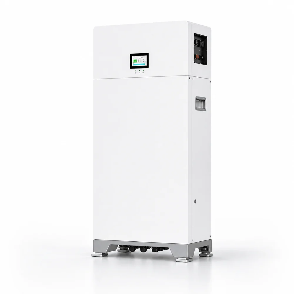
Au sol
314 Ah · 16,08 kWh
- Chemin d’accès au système répertorié UL9540
- Option extérieure IP65
- Classe 145,5 kg
Voir les détails du 314Ah →
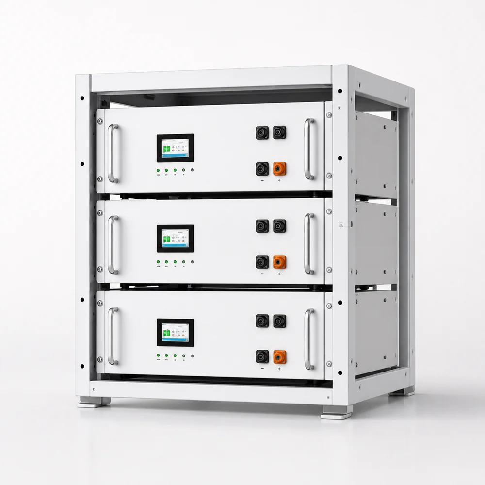
Rack modulaire
Système de 10 à 15 kWh
- Compatible rack serveur 19 pouces
- Parcs de batteries modulaires
- Communication CAN/RS485
Afficher les détails du rack →
Pourquoi 200 Ah ?
Pourquoi choisir une batterie au lithium de 200 Ah ?
Le choix entre 100 Ah et 200 Ah dépend du profil de votre projet, de la croissance de la charge et des contraintes d’installation. Consultez notre Cadre de sélection 100 Ah contre 200 Ah pour connaître les calculs de décision, ou lisez le Comparaison des coûts LFP et plomb-acide si vous effectuez une mise à niveau à partir d’une banque de plomb existante.

Stockage compact de 10 kWh
Une seule batterie de 200 Ah fournit 10,24 kWh, soit suffisamment pour couvrir les charges essentielles d’une maison typique pendant la nuit ou en cas de panne de réseau.
Gain de place mural
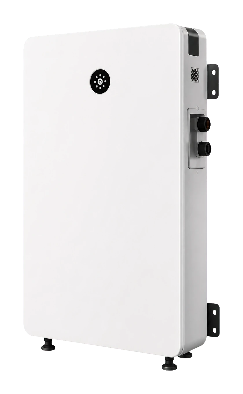
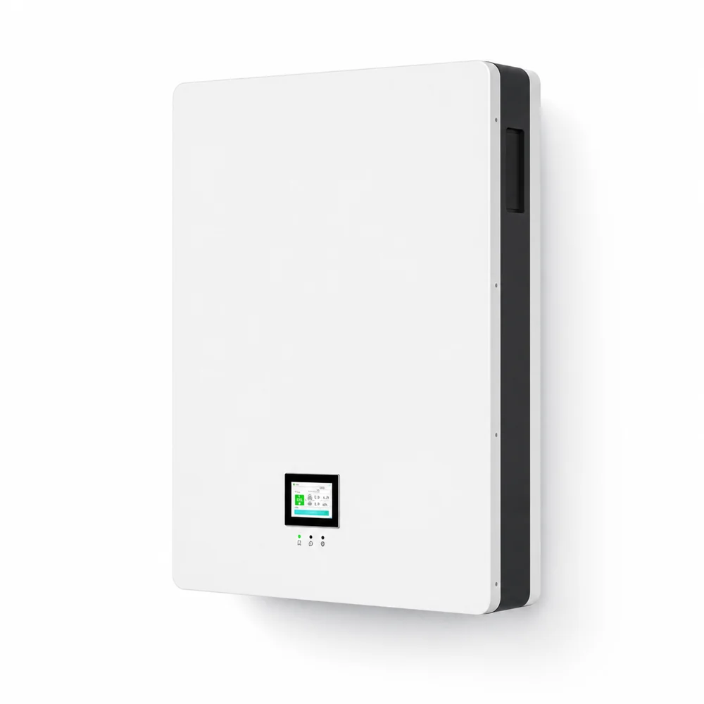
Mesurant 780 x 550 x 160 mm, cette batterie LiFePO4 de 200 Ah se monte à plat contre un garage ou un mur utilitaire sans prendre de place au sol.
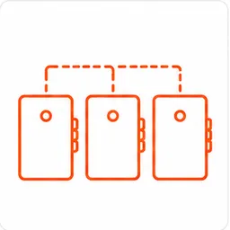
Empilable et évolutif selon vos besoins
En parallèle jusqu’à 16 unités empilables pour une capacité totale de 163 kWh. Commencez avec une batterie de 200 Ah et développez-la à mesure que les besoins énergétiques augmentent.
SpécificationsDétails techniques de la batterie 200 Ah
| Modèle | Mur de stockage d’énergie Savolture 200Ah |
|---|
| Capacité | 200Ah |
|---|
| Énergie | 10,24 kWh |
|---|
| Tension nominale | 51,2 V — tableau de tension complet |
|---|
| Courant de charge maximum | 150A |
|---|
| Courant de décharge maximum | 150 A — guide des tailles de câbles |
|---|
| Cycle de vie | 6 500 cycles à 80 % de DoD — facteurs de durée de vie expliqués |
|---|
| Chimie | LiFePO4 (phosphate de fer et de lithium) |
|---|
| Certifications | CEI62619 |
|---|
| Indice IP | IP20 intérieur / IP65 extérieur |
|---|
| Dimensions | 780x550x160mm |
|---|
| Poids | 84,5kg |
|---|
| GTC | BMS intelligent intégré |
|---|
| Communications | CAN / RS485 |
|---|
| Mise en place | Support mural |
|---|
| Garantie | 15 ans |
|---|
Comparez200 Ah par rapport aux autres batteries Savolture
| Paramètre | 200Ah | 280Ah | 314Ah |
|---|
| Énergie | 10,24 kWh | 14,34 kWh | 16,08 kWh |
| Facteur de forme | Montage mural | Montage mural | Au sol |
| Cycles | 6,500 | 8,500 | 8,500 |
| UL9540 | – | Oui | Oui |
| Poids | 84,5kg | 142,5 kg | 145,5 kg |
| Idéal pour | Sauvegarde essentielle, petit hors réseau | Sauvegarde de toute la maison | Capacité maximale, extérieur |
| Détails | Page actuelle | Voir 280Ah → | Voir 314Ah → |
 Schneider
 Victron
Basé sur les enregistrements de prise en charge du protocole Savolture 51200 pour les systèmes de batterie 48 V. Confirmez le modèle de l’onduleur, le micrologiciel, le protocole de communication et la région avant la mise en service.
Chaîne prêteConçu pour les installateurs et les distributeurs solaires

Documents de certification
Prise en charge de la documentation IEC62619 pour l’examen des installateurs et des distributeurs.

GTB interne
Protection intelligente BMS avec communication CAN et RS485.

Garantie de 15 ans
Options de couverture à long terme pour les projets de stockage résidentiel.

Devis 24 heures
Dimensionnement du projet, couplage des onduleurs et réponse tarifaire dans les 24 heures.
Combien coûte une batterie au lithium de 200 Ah ?
Le prix dépend de la quantité commandée, de la configuration et des coûts actuels des cellules, qui évoluent dans le temps. En tant que ligne directe avec l’usine, nous ne publions pas de prix catalogue fixe : envoyez les spécifications et le volume de votre projet, et nous vous renverrons un devis détaillé dans les 24 heures.
S’agit-il d’une batterie provenant directement de l’usine ou vendue par l’intermédiaire d’un distributeur ?
Savolture est fabriqué directement en usine. Les systèmes sont construits dans notre usine de batteries automatisée de 1,8 GWh et proposés directement aux installateurs et aux distributeurs, sans couche de majoration au détail. Les prix du volume et des commandes répétées évoluent en fonction de la quantité.
De combien de panneaux solaires ai-je besoin pour une batterie au lithium de 200 Ah ?
Avec un système 51,2 V, une batterie de 200 Ah a une capacité de 10,24 kWh. Pour charger complètement à partir de l’énergie solaire en 5 heures de pointe, vous avez besoin d’environ 2 à 2,5 kW de panneaux solaires, soit environ 4 à 5 panneaux de 500 W, selon le contrôleur de charge et l’emplacement.
Combien de temps une batterie de 200 Ah alimentera-t-elle ma maison ?
Une batterie au lithium de 200 Ah à 51,2 V fournit 10,24 kWh d’énergie stockée. À 80 % du DoD, cela représente environ 8,2 kWh utilisables. Pour les charges essentielles d’une moyenne de 500 à 700 W, attendez environ 12 à 16 heures de sauvegarde.
Puis-je utiliser une batterie au lithium de 200 Ah pour vivre hors réseau ?
Oui. Une seule unité de 200 Ah fonctionne bien pour les petites cabines hors réseau ayant des besoins énergétiques modestes. Pour une maison entièrement hors réseau, envisagez de mettre en parallèle 2 à 3 unités ou de passer à un modèle de 280 Ah ou 314 Ah pour plus de capacité.
Quelle est la différence entre 200 Ah et 200 ampères-heure ?
C’est la même chose. 200 Ah, ou ampères-heures, et 200 ampères-heure décrivent une capacité identique. À 51,2 V nominal, les deux équivalent à 10,24 kWh d’énergie stockée.
Une batterie LiFePO4 de 200 Ah est-elle meilleure qu’une batterie au plomb ?
LiFePO4 offre une plus grande capacité utilisable, dure beaucoup plus longtemps, pèse moins et ne nécessite aucun entretien par rapport au plomb. Le coût initial est plus élevé, mais le coût total par kWh sur la durée de vie est généralement inférieur.
Quelles sont les certifications de la batterie Savolture 200Ah ?
La batterie Savolture 200 Ah est certifiée internationale en matière de sécurité IEC62619. Pour les projets nécessitant une homologation UL9540 au niveau du système, consultez nos modèles 280 Ah et 314 Ah.
10,24 kWh suffisent-ils pour alimenter toute ma maison ?
Pour une sauvegarde de charge partielle (lumières/réfrigérateur/WiFi/une seule zone AC), 200 Ah dure 1 à 2 jours. Pour les charges essentielles de toute la maison, évaluez votre consommation via notre calculateur de batterie : de nombreuses maisons unifamiliales américaines ont besoin de 2 à 3 × 200 Ah ou d’une unité de 314 Ah.
{“@context”:”https://schema.org”,”@graph”:[{“@type”:”Product”,”@id”:”https://savolture.com/fr/products/200ah-lithium-battery/#webpage”,”url”:”https://savolture.com/fr/products/200ah-lithium-battery/”,”name”:”Batterie au lithium 200 Ah pour l’énergie solaire et de secours”,”description”:”Batterie au lithium 200 Ah pour l’énergie solaire et de secours : documentation technique et approvisionnement direct d’usine de batteries LiFePO4 pour installateurs et distributeurs.”,”inLanguage”:”fr”,”author”:{“@id”:”https://savolture.com/#organization”},”publisher”:{“@id”:”https://savolture.com/#organization”}},{“@type”:”Organization”,”@id”:”https://savolture.com/#organization”,”name”:”Savolture”,”url”:”https://savolture.com/”,”inLanguage”:”fr”}]}



 10,24 kWhCapacité
 6500+Cycles
 51,2 VNominal
 24 heuresCitation