body.sv-lang-fr .entry-header,
body.sv-lang-fr .ast-breadcrumbs-wrapper,
body.sv-lang-fr .ast-breadcrumb-nav{display:none!important}
body.sv-lang-fr .site-header,
body.sv-lang-fr #masthead,
body.sv-lang-fr .site-footer,
body.sv-lang-fr #colophon{display:none!important}
body.sv-lang-fr .site-content,
body.sv-lang-fr .site-content .ast-container,
body.sv-lang-fr .site-content .content-area,
body.sv-lang-fr #primary,
body.sv-lang-fr .site-main,
body.sv-lang-fr article,
body.sv-lang-fr .entry-content{width:100%!important;max-width:none!important;margin:0!important;padding:0!important}
body.sv-lang-fr .entry-content>*{width:100%!important;max-width:none!important}
body.sv-lang-fr,
body.sv-lang-fr #page,
body.sv-lang-fr .site,
body.sv-lang-fr .site-content{overflow-x:hidden}
body.sv-lang-fr #ht-ctc-chat{right:14px!important;bottom:14px!important}
body.sv-lang-fr .sv314-page{–sv314-navy:#1A365D;–sv314-deep:#071322;–sv314-ink:#102235;–sv314-muted:#5F7084;–sv314-line:#E2E8F0;–sv314-soft:#F5F7FA;–sv314-orange:#F97316;–sv314-blue:#38BDF8;–sv314-white:#FFFFFF;width:100vw!important;max-width:100vw!important;margin-left:calc(50% – 50vw)!important;margin-right:calc(50% – 50vw)!important;overflow-x:hidden;background:#fff;color:var(–sv314-ink);font-family:Manrope,Inter,system-ui,-apple-system,BlinkMacSystemFont,”Segoe UI”,sans-serif}
body.sv-lang-fr .sv314-page *{box-sizing:border-box}
body.sv-lang-fr .sv314-page a{color:inherit;text-decoration:none!important}
body.sv-lang-fr .sv314-page img{display:block;max-width:100%}
body.sv-lang-fr .sv314-wrap,
body.sv-lang-fr .sv314-nav-container,
body.sv-lang-fr .sv314-footer-container{width:100%;max-width:1200px;margin:0 auto;padding:0 40px}
body.sv-lang-fr .sv314-section{padding:78px 0}
body.sv-lang-fr .sv314-showcase{padding:78px 0;background:#fff;border-top:1px solid var(–sv314-line)}
body.sv-lang-fr .sv314-showcase-grid{display:grid;grid-template-columns:repeat(3,minmax(0,1fr));gap:22px;max-width:1240px;margin:36px auto 0}
body.sv-lang-fr .sv314-showcase-card{border:1px solid var(–sv314-line);border-radius:10px;overflow:hidden;background:#fff;box-shadow:0 18px 44px rgba(26,54,93,.07);transition:transform .18s ease,box-shadow .18s ease}
body.sv-lang-fr .sv314-showcase-card:hover{transform:translateY(-4px);box-shadow:0 26px 56px rgba(26,54,93,.14)}
body.sv-lang-fr .sv314-showcase-img{width:100%;aspect-ratio:4/3;object-fit:cover;display:block;background:#f1f5f9}
body.sv-lang-fr .sv314-showcase-body{padding:22px 24px 26px}
body.sv-lang-fr .sv314-showcase-tag{display:inline-block;margin:0 0 10px;padding:4px 11px;border-radius:999px;background:rgba(56,189,248,.12);color:#1A365D;font-size:11px;font-weight:900;letter-spacing:.06em;text-transform:uppercase}
body.sv-lang-fr .sv314-showcase-card h3{margin:0 0 9px;font-size:18px;font-weight:900;line-height:1.22;color:var(–sv314-ink)}
body.sv-lang-fr .sv314-showcase-card p{margin:0;color:var(–sv314-muted);font-size:13.5px;line-height:1.55}
@media (max-width:1080px){body.sv-lang-fr .sv314-showcase-grid{grid-template-columns:repeat(2,minmax(0,1fr))}}
@media (max-width:768px){body.sv-lang-fr .sv314-showcase-grid{grid-template-columns:1fr;max-width:560px}}
body.sv-lang-fr .sv314-matrix{padding:78px 0;background:#f8fafc;border-top:1px solid var(–sv314-line)}
body.sv-lang-fr .sv314-matrix-grid{display:grid;grid-template-columns:repeat(4,minmax(0,1fr));gap:22px;max-width:1240px;margin:36px auto 0}
body.sv-lang-fr .sv314-matrix-card{position:relative;display:flex;flex-direction:column;min-height:480px;border:1px solid var(–sv314-line);border-radius:10px;background:#fff;overflow:hidden;box-shadow:0 18px 44px rgba(26,54,93,.07);transition:transform .18s ease,box-shadow .18s ease}
body.sv-lang-fr .sv314-matrix-card:hover{transform:translateY(-4px);box-shadow:0 26px 56px rgba(26,54,93,.14)}
body.sv-lang-fr .sv314-matrix-card.is-current{border:2px solid var(–sv314-orange);box-shadow:0 22px 50px rgba(249,115,22,.16)}
body.sv-lang-fr .sv314-matrix-badge{position:absolute;top:14px;right:14px;padding:5px 12px;border-radius:999px;background:var(–sv314-orange);color:#fff;font-size:10.5px;font-weight:900;letter-spacing:.06em;text-transform:uppercase;z-index:2}
body.sv-lang-fr .sv314-matrix-media{display:grid;min-height:200px;place-items:center;background:linear-gradient(180deg,#fff,#f5f8fb)}
body.sv-lang-fr .sv314-matrix-media img{max-width:78%;max-height:180px;object-fit:contain}
body.sv-lang-fr .sv314-matrix-body{display:flex;flex:1;flex-direction:column;padding:22px 24px}
body.sv-lang-fr .sv314-matrix-body h3{margin:0 0 8px;font-size:17px;font-weight:900;color:var(–sv314-ink)}
body.sv-lang-fr .sv314-matrix-body .sv314-matrix-spec{display:block;margin:0 0 16px;color:#1A365D;font-size:21px;font-weight:900;letter-spacing:-.01em}
body.sv-lang-fr .sv314-matrix-body ul{display:grid;gap:8px;margin:0 0 18px;padding:0;list-style:none;color:#506276;font-size:13px;line-height:1.45}
body.sv-lang-fr .sv314-matrix-body li:before{content:””;display:inline-block;width:5px;height:5px;margin-right:8px;border-radius:50%;background:#F97316;vertical-align:middle}
body.sv-lang-fr .sv314-matrix-link{margin-top:auto;color:#F97316;font-size:13.5px;font-weight:900;text-decoration:none}
body.sv-lang-fr .sv314-matrix-link:hover{color:#EA580C}
body.sv-lang-fr .sv314-matrix-link.is-current{color:#506276;cursor:default;pointer-events:none}
@media (max-width:1080px){body.sv-lang-fr .sv314-matrix-grid{grid-template-columns:repeat(2,minmax(0,1fr))}}
@media (max-width:600px){body.sv-lang-fr .sv314-matrix-grid{grid-template-columns:1fr;max-width:520px}}
body.sv-lang-fr .sv314-soft{background:var(–sv314-soft)}
body.sv-lang-fr .sv314-dark{background:linear-gradient(135deg,#071322 0%,#12345a 100%)}
body.sv-lang-fr .sv314-kicker{display:inline-flex;align-items:center;margin:0 0 12px;padding:7px 11px;border-radius:999px;background:rgba(249,115,22,.12);color:var(–sv314-orange);font-size:11px;font-weight:900;letter-spacing:.08em;text-transform:uppercase}
body.sv-lang-fr .sv314-page h1,
body.sv-lang-fr .sv314-page h2,
body.sv-lang-fr .sv314-page h3,
body.sv-lang-fr .sv314-page p{max-width:100%;overflow-wrap:break-word}
body.sv-lang-fr .sv314-page h1,
body.sv-lang-fr .sv314-page h2,
body.sv-lang-fr .sv314-page h3{margin:0;color:var(–sv314-ink);letter-spacing:0;line-height:1.08}
body.sv-lang-fr .sv314-page h1{max-width:660px;color:#fff;font-size:clamp(38px,3.35vw,52px)}
body.sv-lang-fr .sv314-page h2{font-size:clamp(30px,3vw,44px);text-align:center}
body.sv-lang-fr .sv314-page h3{font-size:20px}
body.sv-lang-fr .sv314-page p{margin:0;color:var(–sv314-muted);font-size:16px;line-height:1.68}
body.sv-lang-fr .sv314-section-head{max-width:850px;margin:0 auto 36px;text-align:center}
body.sv-lang-fr .sv314-section-head p{margin-top:12px}
body.sv-lang-fr .sv314-header{position:sticky;top:0;z-index:50;border-bottom:1px solid #e7eef6;background:rgba(255,255,255,.96);backdrop-filter:blur(14px)}
body.sv-lang-fr .sv314-nav{display:flex;min-height:76px;align-items:center;justify-content:space-between;gap:28px}
body.sv-lang-fr .sv314-logo{display:inline-flex;align-items:center;flex:0 0 auto;width:174px;height:42px;line-height:0}
body.sv-lang-fr .sv314-logo-img{width:174px;height:42px;object-fit:contain;object-position:left center}
body.sv-lang-fr .sv314-menu{display:flex;align-items:center;gap:26px;color:#203650;font-size:13px;font-weight:800}
body.sv-lang-fr .sv314-nav-item{position:relative}
body.sv-lang-fr .sv314-nav-link{display:inline-flex;min-height:76px;align-items:center;gap:7px;color:#203650;transition:color .16s easewhite-space:nowrap}
body.sv-lang-fr .sv314-nav-link:hover{color:var(–sv314-orange)}
body.sv-lang-fr .sv314-nav-arrow{width:13px;height:13px;transition:transform .16s ease}
body.sv-lang-fr .sv314-submenu{position:absolute;top:100%;left:-12px;z-index:55;display:grid;min-width:258px;gap:3px;padding:10px;border:1px solid #dbe5ef;border-radius:8px;background:#fff;box-shadow:0 18px 42px rgba(10,37,64,.16);opacity:0;visibility:hidden;transform:translateY(8px);transition:opacity .16s ease,transform .16s ease,visibility .16s ease}
body.sv-lang-fr .sv314-nav-item:hover .sv314-submenu,
body.sv-lang-fr .sv314-nav-item:focus-within .sv314-submenu{opacity:1;visibility:visible;transform:translateY(0)}
body.sv-lang-fr .sv314-nav-item:hover .sv314-nav-arrow,
body.sv-lang-fr .sv314-nav-item:focus-within .sv314-nav-arrow{transform:rotate(180deg)}
body.sv-lang-fr .sv314-submenu a{display:block;padding:10px 12px;border-radius:6px;color:#0A2540;font-size:13px;line-height:1.24;white-space:nowrap}
body.sv-lang-fr .sv314-submenu a:hover{background:#f3f7fb;color:var(–sv314-orange)}
body.sv-lang-fr .sv314-top-quote{display:inline-flex;min-height:45px;align-items:center;justify-content:center;padding:0 20px;border-radius:6px;background:var(–sv314-orange);color:#fff;font-size:13px;font-weight:900;box-shadow:0 14px 26px rgba(249,115,22,.28)}
body.sv-lang-fr .sv314-mobile-toggle,
body.sv-lang-fr .sv314-mobile-trigger,
body.sv-lang-fr .sv314-mobile-panel{display:none}
body.sv-lang-fr .sv314-mobile-toggle{position:absolute;width:1px;height:1px;opacity:0;pointer-events:none}
body.sv-lang-fr .sv314-hero{position:relative;min-height:700px;overflow:hidden;background:radial-gradient(circle at 69% 46%,rgba(56,189,248,.34),rgba(56,189,248,0) 32%),radial-gradient(circle at 28% 0%,rgba(249,115,22,.13),rgba(249,115,22,0) 28%),linear-gradient(135deg,#06111f 0%,#0B1929 44%,#10294a 100%)}
body.sv-lang-fr .sv314-hero:before{content:””;position:absolute;inset:0;z-index:0;opacity:.16;background:linear-gradient(90deg,rgba(255,255,255,.05) 1px,transparent 1px),linear-gradient(180deg,rgba(255,255,255,.045) 1px,transparent 1px);background-size:72px 72px;mask-image:linear-gradient(90deg,transparent 0%,#000 42%,#000 100%)}
body.sv-lang-fr .sv314-hero:after{content:””;position:absolute;right:-9%;top:8%;z-index:0;width:54%;height:86%;border-radius:48px;background:linear-gradient(135deg,rgba(56,189,248,.14),rgba(255,255,255,.03) 44%,rgba(249,115,22,.08));box-shadow:inset 0 0 0 1px rgba(255,255,255,.08),0 40px 120px rgba(56,189,248,.15);transform:skewX(-9deg)}
body.sv-lang-fr .sv314-hero-overlay{position:absolute;inset:0;z-index:1;background:linear-gradient(90deg,rgba(6,17,31,.98) 0%,rgba(6,17,31,.92) 39%,rgba(6,17,31,.58) 64%,rgba(6,17,31,.25) 100%)}
body.sv-lang-fr .sv314-hero .sv314-wrap{max-width:1320px}
body.sv-lang-fr .sv314-hero-inner{position:relative;z-index:2;display:grid;grid-template-columns:minmax(0,620px) minmax(420px,600px);align-items:center;gap:clamp(20px,3vw,46px);min-height:700px;padding-top:48px;padding-bottom:58px}
body.sv-lang-fr .sv314-breadcrumb{margin:0 0 18px;color:rgba(255,255,255,.68);font-size:12px}
body.sv-lang-fr .sv314-breadcrumb a{color:rgba(255,255,255,.9)}
body.sv-lang-fr .sv314-hero-copy{max-width:620px}
body.sv-lang-fr .sv314-hero-copy>p:not(.sv314-breadcrumb){max-width:590px;margin-top:20px;color:#d5e0eb;font-size:16.5px;line-height:1.62}
body.sv-lang-fr .sv314-chip-row{display:grid;grid-template-columns:repeat(4,minmax(0,1fr));gap:10px;max-width:660px;margin-top:30px}
body.sv-lang-fr .sv314-chip{display:flex;min-height:78px;align-items:center;gap:10px;padding:12px;border:1px solid rgba(255,255,255,.20);border-radius:8px;background:linear-gradient(180deg,rgba(255,255,255,.11),rgba(255,255,255,.055));color:#fff;backdrop-filter:blur(14px);box-shadow:0 18px 40px rgba(0,0,0,.16)}
body.sv-lang-fr .sv314-chip img{width:29px;height:29px;flex:0 0 auto;object-fit:contain}
body.sv-lang-fr .sv314-chip strong{display:block;color:#fff;font-size:13px;font-weight:900;line-height:1.05;white-space:nowrap}
body.sv-lang-fr .sv314-chip span{display:block;margin-top:4px;color:#c8d3df;font-size:9.5px;font-weight:800;line-height:1.1}
body.sv-lang-fr .sv314-btn-row{display:flex;flex-wrap:wrap;gap:14px;margin-top:30px}
body.sv-lang-fr .sv314-btn{display:inline-flex;min-height:52px;align-items:center;justify-content:center;gap:10px;padding:0 22px;border:1px solid transparent;border-radius:8px;font-size:14px;font-weight:900;transition:transform .16s ease,box-shadow .16s ease}
body.sv-lang-fr .sv314-btn:hover{transform:translateY(-2px)}
body.sv-lang-fr .sv314-btn-orange{color:#fff;background:var(–sv314-orange);box-shadow:0 18px 38px rgba(249,115,22,.28)}
body.sv-lang-fr .sv314-page .sv314-btn-outline,
body.sv-lang-fr .sv314-btn-outline{color:#fff!important;border-color:rgba(255,255,255,.42);background:rgba(255,255,255,.04)}
body.sv-lang-fr .sv314-hero-product{display:flex;align-items:center;justify-content:center;min-width:0}
body.sv-lang-fr .sv314-product-frame{position:relative;width:min(620px,100%);aspect-ratio:1.18/1;overflow:visible;border:0;border-radius:0;background:transparent;box-shadow:none;isolation:isolate}
body.sv-lang-fr .sv314-product-frame:before{content:””;position:absolute;left:7%;right:2%;top:8%;bottom:4%;z-index:0;border-radius:34px;background:radial-gradient(circle at 56% 44%,rgba(56,189,248,.32),rgba(56,189,248,.08) 48%,rgba(255,255,255,.02) 100%);box-shadow:0 32px 90px rgba(0,0,0,.34),inset 0 0 0 1px rgba(255,255,255,.12)}
body.sv-lang-fr .sv314-product-frame:after{content:”16.08 kWh / 314Ah cells”;position:absolute;right:0;bottom:13%;z-index:3;padding:11px 14px;border:1px solid rgba(255,255,255,.18);border-radius:8px;background:rgba(6,17,31,.72);color:#fff;font-size:12px;font-weight:900;letter-spacing:.01em;box-shadow:0 18px 38px rgba(0,0,0,.24);backdrop-filter:blur(14px)}
body.sv-lang-fr .sv314-product-frame img{position:relative;z-index:1;width:112%;height:100%;margin-left:-4%;object-fit:cover;object-position:center right;border-radius:30px;mask-image:linear-gradient(90deg,transparent 0%,#000 10%,#000 90%,transparent 100%);-webkit-mask-image:linear-gradient(90deg,transparent 0%,#000 10%,#000 90%,transparent 100%)}
body.sv-lang-fr .sv314-quick{padding:42px 0 40px;background:#fff}
body.sv-lang-fr .sv314-quick-grid{display:grid;grid-template-columns:repeat(3,minmax(0,1fr));gap:18px;max-width:1160px;margin:0 auto}
body.sv-lang-fr .sv314-quick-card{position:relative;display:block;min-height:164px;padding:0!important;border:1px solid var(–sv314-line);border-radius:8px;background:#fff;box-shadow:0 10px 30px rgba(26,54,93,.055)}
body.sv-lang-fr .sv314-quick-card img{position:absolute;left:31px;top:34px;width:48px;height:48px;object-fit:contain}
body.sv-lang-fr .sv314-quick-card div{position:absolute;left:100px;top:31px;right:30px}
body.sv-lang-fr .sv314-quick-card h3{margin:0 0 8px;font-size:15px;font-weight:900;line-height:1.2}
body.sv-lang-fr .sv314-quick-card p{max-width:270px;font-size:12.5px;line-height:1.56}
body.sv-lang-fr .sv314-card-grid{display:grid;grid-template-columns:repeat(3,minmax(0,1fr));gap:18px;max-width:1160px;margin:0 auto}
body.sv-lang-fr .sv314-info-card{position:relative;display:block;min-height:176px;padding:0!important;border:1px solid var(–sv314-line);border-radius:8px;background:#fff;box-shadow:0 10px 30px rgba(26,54,93,.055)}
body.sv-lang-fr .sv314-info-card img{position:absolute;left:31px;top:34px;width:48px;height:48px;object-fit:contain}
body.sv-lang-fr .sv314-info-card div{position:absolute;left:100px;top:32px;right:30px}
body.sv-lang-fr .sv314-info-card h3{margin:0 0 8px;font-size:15px;font-weight:900;line-height:1.2}
body.sv-lang-fr .sv314-info-card p{max-width:276px;font-size:12.5px;line-height:1.56}
body.sv-lang-fr .sv314-specs{background:#fff}
body.sv-lang-fr .sv314-specs .sv314-wrap{max-width:1200px}
body.sv-lang-fr .sv314-specs .sv314-section-head{max-width:none;margin:0 0 24px;text-align:left}
body.sv-lang-fr .sv314-specs .sv314-kicker{margin:0 0 10px;padding:0;border-radius:0;background:transparent;color:var(–sv314-orange);font-size:11px;letter-spacing:.08em}
body.sv-lang-fr .sv314-specs h2{text-align:left;font-size:clamp(30px,2.55vw,38px)}
body.sv-lang-fr .sv314-spec-layout{display:grid;grid-template-columns:minmax(0,1fr) minmax(400px,.9fr);gap:36px;align-items:start}
body.sv-lang-fr .sv314-table-card,
body.sv-lang-fr .sv314-tech-card,
body.sv-lang-fr .sv314-compare-wrap{overflow:hidden;border:1px solid var(–sv314-line);border-radius:8px;background:#fff;box-shadow:0 18px 44px rgba(26,54,93,.07)}
body.sv-lang-fr .sv314-spec-table,
body.sv-lang-fr .sv314-compare-table{width:100%;border-collapse:collapse}
body.sv-lang-fr .sv314-spec-table th,
body.sv-lang-fr .sv314-spec-table td,
body.sv-lang-fr .sv314-compare-table th,
body.sv-lang-fr .sv314-compare-table td{padding:12px 15px;border-bottom:1px solid var(–sv314-line);font-size:13.5px;text-align:left;vertical-align:top}
body.sv-lang-fr .sv314-spec-table th{width:40%;color:#102235;background:#f8fafc;font-weight:900}
body.sv-lang-fr .sv314-spec-table td{color:#45586d}
body.sv-lang-fr .sv314-spec-table tr:last-child th,
body.sv-lang-fr .sv314-spec-table tr:last-child td,
body.sv-lang-fr .sv314-compare-table tr:last-child td{border-bottom:0}
body.sv-lang-fr .sv314-tech-stack{display:grid;gap:16px}
body.sv-lang-fr .sv314-tech-card{padding:18px!important}
body.sv-lang-fr .sv314-tech-card img{width:100%;border-radius:8px;background:#eef8ff}
body.sv-lang-fr .sv314-tech-card h3{margin:16px 0 8px;font-size:18px}
body.sv-lang-fr .sv314-tech-card p{font-size:13.5px;line-height:1.55}
body.sv-lang-fr .sv314-compare-wrap{overflow:auto}
body.sv-lang-fr .sv314-compare-table{min-width:980px}
body.sv-lang-fr .sv314-compare-table th{color:#fff;background:#102235;font-weight:900;text-align:center}
body.sv-lang-fr .sv314-compare-table th:first-child,
body.sv-lang-fr .sv314-compare-table td:first-child{text-align:left;font-weight:900}
body.sv-lang-fr .sv314-compare-table td{color:#45586d;text-align:center}
body.sv-lang-fr .sv314-compare-table tr:nth-child(even) td{background:#f8fafc}
body.sv-lang-fr .sv314-table-note{margin-top:14px;color:#6d7c8f;font-size:12px;text-align:center}
body.sv-lang-fr .sv314-use-grid{display:grid;grid-template-columns:repeat(4,minmax(0,1fr));gap:18px;max-width:1240px;margin:0 auto}
body.sv-lang-fr .sv314-use-card{min-height:270px;padding:26px 22px!important;border:1px solid var(–sv314-line);border-radius:8px;background:#fff;box-shadow:0 18px 44px rgba(26,54,93,.07)}
body.sv-lang-fr .sv314-use-card img{width:54px;height:54px;margin-bottom:18px}
body.sv-lang-fr .sv314-use-card h3{margin:0 0 10px;font-size:18px}
body.sv-lang-fr .sv314-use-card p{font-size:14px;line-height:1.58}
body.sv-lang-fr .sv314-use-card span{display:inline-flex;margin-top:16px;color:var(–sv314-orange);font-size:13px;font-weight:900}
body.sv-lang-fr .sv314-heating{color:#c9d5e1}
body.sv-lang-fr .sv314-heating h2,
body.sv-lang-fr .sv314-heating h3{color:#fff}
body.sv-lang-fr .sv314-heating .sv314-section-head p{color:#c9d5e1}
body.sv-lang-fr .sv314-heating-layout{display:grid;grid-template-columns:minmax(0,1.15fr) minmax(0,1fr);gap:28px;align-items:stretch}
body.sv-lang-fr .sv314-heating-visual{overflow:hidden;border:1px solid rgba(255,255,255,.12);border-radius:8px;background:#071322;box-shadow:0 22px 52px rgba(0,0,0,.22)}
body.sv-lang-fr .sv314-heating-visual{display:flex;align-items:center;justify-content:center;padding:8px}body.sv-lang-fr .sv314-heating-visual img{width:100%;height:auto;max-width:100%;object-fit:contain;display:block}
body.sv-lang-fr .sv314-heating-grid{display:grid;grid-template-columns:1fr;gap:14px}
body.sv-lang-fr .sv314-heating-card{display:flex;align-items:flex-start;gap:14px;min-height:0;padding:18px 20px!important;border:1px solid rgba(255,255,255,.16);border-radius:8px;background:rgba(255,255,255,.06)}
body.sv-lang-fr .sv314-heating-card img{flex:0 0 auto;width:40px;height:40px;margin:0}
body.sv-lang-fr .sv314-heating-card>div{flex:1 1 auto;min-width:0}
body.sv-lang-fr .sv314-heating-card h3{font-size:16px!important;line-height:1.25;margin:0 0 6px;white-space:nowrap;overflow:hidden;text-overflow:ellipsis}
body.sv-lang-fr .sv314-heating-card p{font-size:13px;line-height:1.5;margin:0;color:#c9d5e1}
body.sv-lang-fr .sv314-heating-card p{color:#c9d5e1;font-size:13.5px;line-height:1.58}
body.sv-lang-fr .sv314-inverter-grid{display:grid;grid-template-columns:repeat(6,minmax(0,1fr));gap:12px;max-width:1220px;margin:26px auto 0}
body.sv-lang-fr .sv314-inverter-card{display:flex;min-height:78px;align-items:center;justify-content:center;padding:12px!important;border:1px solid var(–sv314-line);border-radius:8px;background:#fff;color:#34465c;font-size:13px;font-weight:900;text-align:center;box-shadow:0 10px 28px rgba(26,54,93,.045)}
body.sv-lang-fr .sv314-inverter-note{max-width:900px;margin:16px auto 0;color:#6d7c8f;font-size:12px;text-align:center}
body.sv-lang-fr .sv314-inverter-logos{display:grid;grid-template-columns:repeat(8,minmax(0,1fr));gap:10px;max-width:1180px;margin:26px auto 0}
body.sv-lang-fr .sv314-ilogo{display:flex;min-height:64px;align-items:center;justify-content:center;gap:8px;border:1px solid var(–sv314-line);border-radius:6px;background:#fff;color:#6f7882;filter:grayscale(1);box-shadow:0 10px 28px rgba(26,54,93,.045)}
body.sv-lang-fr .sv314-ilogo img{display:block;max-width:112px;max-height:34px;width:auto;height:auto;object-fit:contain;opacity:.82}
body.sv-lang-fr .sv314-ilogo span{display:inline-block;color:#6f7882;font-size:14px;font-weight:900;line-height:1}
body.sv-lang-fr .sv314-ilogo–wide img{max-width:122px;max-height:32px}
body.sv-lang-fr .sv314-ilogo–small img{max-width:100px;max-height:34px}
body.sv-lang-fr .sv314-ilogo–icon img{width:28px;height:28px}
@media (max-width:1080px){body.sv-lang-fr .sv314-inverter-logos{grid-template-columns:repeat(4,minmax(0,1fr))}}
@media (max-width:768px){body.sv-lang-fr .sv314-inverter-logos{grid-template-columns:repeat(2,minmax(0,1fr))}}
@media (max-width:480px){body.sv-lang-fr .sv314-inverter-logos{grid-template-columns:1fr}}
body.sv-lang-fr .sv314-channel-grid{display:grid;grid-template-columns:repeat(4,minmax(0,1fr));gap:18px;max-width:1240px;margin:0 auto}
body.sv-lang-fr .sv314-channel-card{position:relative;display:block;min-height:188px;padding:0!important;border:1px solid var(–sv314-line);border-radius:8px;background:#fff;box-shadow:0 18px 44px rgba(26,54,93,.08)}
body.sv-lang-fr .sv314-channel-card img{position:absolute;left:28px;top:34px;width:46px;height:46px;object-fit:contain}
body.sv-lang-fr .sv314-channel-card div{position:absolute;left:94px;top:32px;right:24px}
body.sv-lang-fr .sv314-channel-card h3{margin:0 0 8px;font-size:14.5px;font-weight:900;line-height:1.18}
body.sv-lang-fr .sv314-channel-card p{font-size:12.5px;line-height:1.54}
body.sv-lang-fr .sv314-center-actions{justify-content:center;margin-top:28px}
body.sv-lang-fr .sv314-faq{background:var(–sv314-soft)}
body.sv-lang-fr .sv314-faq-list{max-width:1180px;margin:0 auto;display:grid;grid-template-columns:repeat(2,minmax(0,1fr));gap:12px 18px}
body.sv-lang-fr .sv314-faq details{border:1px solid var(–sv314-line);border-radius:8px;background:#fff}
body.sv-lang-fr .sv314-faq summary{display:flex;min-height:58px;align-items:center;justify-content:space-between;gap:18px;cursor:pointer;padding:0 22px;color:#102235;font-size:14px;font-weight:900;line-height:1.25;list-style:none}
body.sv-lang-fr .sv314-faq summary:after{content:”+”;flex:0 0 auto;color:#71839a;font-size:24px;font-weight:700;line-height:1;transition:transform .16s ease}
body.sv-lang-fr .sv314-faq details[open] summary:after{transform:rotate(45deg)}
body.sv-lang-fr .sv314-faq summary::-webkit-details-marker{display:none}
body.sv-lang-fr .sv314-faq details p{padding:0 22px 20px;font-size:14px;line-height:1.55}
body.sv-lang-fr .sv314-final{background:linear-gradient(135deg,#071322,#1A365D);text-align:center}
body.sv-lang-fr .sv314-final h2{color:#fff}
body.sv-lang-fr .sv314-final p{max-width:760px;margin:16px auto 0;color:#c9d5e1}
body.sv-lang-fr .sv314-final .sv314-btn-row{justify-content:center}
body.sv-lang-fr .sv314-footer{padding:34px 0 20px;color:rgba(255,255,255,.72);background:linear-gradient(135deg,#061a2f 0%,#092a4a 100%)}
body.sv-lang-fr .sv314-footer-grid{display:grid;grid-template-columns:repeat(4,minmax(0,1fr)) minmax(230px,1.05fr);gap:28px;align-items:start}
body.sv-lang-fr .sv314-footer h3{margin:0 0 12px;color:#fff;font-size:12px;font-weight:800;letter-spacing:.07em;text-transform:uppercase}
body.sv-lang-fr .sv314-footer a{display:block;padding:4px 0;color:rgba(255,255,255,.68);font-size:13px}
body.sv-lang-fr .sv314-footer a:hover{color:#fff}
body.sv-lang-fr .sv314-footer-contact p,
body.sv-lang-fr .sv314-footer-contact span{display:block;margin:0 0 8px;color:rgba(255,255,255,.72);font-size:13px;line-height:1.55}
body.sv-lang-fr .sv314-footer-email{color:#fff!important;font-weight:800}
body.sv-lang-fr .sv314-footer-cta{display:inline-flex!important;align-items:center;justify-content:center;width:100%;min-height:38px;margin-top:10px;padding:0 14px!important;border:1px solid rgba(255,255,255,.32);border-radius:5px;color:#fff!important;font-size:12px!important;font-weight:800}
body.sv-lang-fr .sv314-footer-bottom{display:flex;align-items:center;justify-content:space-between;gap:20px;margin-top:36px;padding-top:22px;border-top:1px solid rgba(255,255,255,.12);font-size:13px}
body.sv-lang-fr .sv314-footer-logo{display:inline-flex;align-items:center}
body.sv-lang-fr .sv314-footer-logo img{width:150px;height:auto}
body.sv-lang-fr .sv314-footer-legal{display:inline-flex;align-items:center;gap:24px;flex-wrap:wrap}
body.sv-lang-fr .sv314-footer-legal a{display:inline-flex;padding:0}
@media (max-width:1080px){
body.sv-lang-fr .sv314-menu{display:none!important}
body.sv-lang-fr .sv314-logo,
body.sv-lang-fr .sv314-logo-img{width:124px;height:28px}
body.sv-lang-fr .sv314-top-quote{display:none}
body.sv-lang-fr .sv314-mobile-trigger{position:static;z-index:42;display:flex!important;justify-self:end;align-self:center;width:auto;min-width:74px;height:34px;align-items:center;justify-content:center;gap:8px;padding:0 10px;border:1px solid var(–sv314-orange);border-radius:6px;background:var(–sv314-orange);cursor:pointer}
body.sv-lang-fr .sv314-mobile-trigger b{color:#fff;font-size:12px;line-height:1;font-weight:900}
body.sv-lang-fr .sv314-mobile-trigger i{display:flex;width:18px;flex-direction:column;gap:5px;font-style:normal}
body.sv-lang-fr .sv314-mobile-trigger i span{display:block;width:18px;height:2px;border-radius:999px;background:#fff;transition:transform .16s ease,opacity .16s ease}
body.sv-lang-fr .sv314-mobile-panel{position:absolute;z-index:41;top:calc(100% + 8px);left:0;right:0;width:100%;display:none;gap:8px;padding:12px;border:1px solid #dbe5ef;border-radius:8px;background:#fff;box-shadow:0 18px 40px rgba(10,37,64,.16);max-height:calc(100vh – 68px);overflow-y:auto}
body.sv-lang-fr .sv314-mobile-toggle:checked~.sv314-mobile-panel,
body.sv-lang-fr .sv314-mobile-panel:focus-within{display:grid}
body.sv-lang-fr .sv314-mobile-toggle:checked+.sv314-mobile-trigger i span:nth-child(1){transform:translateY(7px) rotate(45deg)}
body.sv-lang-fr .sv314-mobile-toggle:checked+.sv314-mobile-trigger i span:nth-child(2){opacity:0}
body.sv-lang-fr .sv314-mobile-toggle:checked+.sv314-mobile-trigger i span:nth-child(3){transform:translateY(-7px) rotate(-45deg)}
body.sv-lang-fr .sv314-mobile-panel a,
body.sv-lang-fr .sv314-mobile-title{display:block;padding:10px 12px;border-radius:6px;color:#0A2540;font-size:13px;font-weight:800}
body.sv-lang-fr .sv314-mobile-title{padding-bottom:4px;color:#708198;font-size:11px;letter-spacing:.08em;text-transform:uppercase}
body.sv-lang-fr .sv314-mobile-panel a:hover{background:#f3f7fb;color:var(–sv314-orange)}
body.sv-lang-fr .sv314-mobile-cta{background:var(–sv314-orange)!important;color:#fff!important;text-align:center}
body.sv-lang-fr .sv314-nav{position:relative;min-height:62px}
body.sv-lang-fr .sv314-wrap,
body.sv-lang-fr .sv314-nav-container,
body.sv-lang-fr .sv314-footer-container{padding:0 24px}
body.sv-lang-fr .sv314-hero{min-height:auto}
body.sv-lang-fr .sv314-hero-inner{grid-template-columns:1fr;gap:28px;min-height:auto;padding-top:44px;padding-bottom:44px}
body.sv-lang-fr .sv314-hero-copy{max-width:720px}
body.sv-lang-fr .sv314-hero-product{max-width:560px}
body.sv-lang-fr .sv314-quick-grid,
body.sv-lang-fr .sv314-card-grid{grid-template-columns:1fr}
body.sv-lang-fr .sv314-spec-layout,
body.sv-lang-fr .sv314-heating-layout{grid-template-columns:1fr}
body.sv-lang-fr .sv314-use-grid,
body.sv-lang-fr .sv314-channel-grid{grid-template-columns:repeat(2,minmax(0,1fr))}
body.sv-lang-fr .sv314-inverter-grid{grid-template-columns:repeat(3,minmax(0,1fr))}
body.sv-lang-fr .sv314-footer-grid{grid-template-columns:repeat(2,minmax(0,1fr))}
}
@media (max-width:768px){
body.sv-lang-fr .sv314-section{padding:58px 0}
body.sv-lang-fr .sv314-chip-row{grid-template-columns:repeat(2,minmax(0,1fr));max-width:100%}
body.sv-lang-fr .sv314-hero-copy>p:not(.sv314-breadcrumb){font-size:15px}
body.sv-lang-fr .sv314-info-card,
body.sv-lang-fr .sv314-quick-card,
body.sv-lang-fr .sv314-channel-card{min-height:auto;padding:24px!important}
body.sv-lang-fr .sv314-info-card img,
body.sv-lang-fr .sv314-quick-card img,
body.sv-lang-fr .sv314-channel-card img{position:static;width:46px;height:46px;margin-bottom:16px}
body.sv-lang-fr .sv314-info-card div,
body.sv-lang-fr .sv314-quick-card div,
body.sv-lang-fr .sv314-channel-card div{position:static}
body.sv-lang-fr .sv314-info-card p,
body.sv-lang-fr .sv314-quick-card p,
body.sv-lang-fr .sv314-channel-card p{max-width:none}
body.sv-lang-fr .sv314-use-grid,
body.sv-lang-fr .sv314-heating-grid,
body.sv-lang-fr .sv314-channel-grid,
body.sv-lang-fr .sv314-faq-list{grid-template-columns:1fr}
body.sv-lang-fr .sv314-spec-table th,
body.sv-lang-fr .sv314-spec-table td{display:block;width:100%}
body.sv-lang-fr .sv314-spec-table th{border-bottom:0;padding-bottom:4px}
body.sv-lang-fr .sv314-spec-table td{padding-top:4px}
body.sv-lang-fr .sv314-footer-bottom{align-items:flex-start;flex-direction:column}
}
@media (max-width:480px){
body.sv-lang-fr .sv314-wrap,
body.sv-lang-fr .sv314-nav-container,
body.sv-lang-fr .sv314-footer-container{padding:0 18px}
body.sv-lang-fr .sv314-page h1{font-size:36px}
body.sv-lang-fr .sv314-page h2{font-size:29px}
body.sv-lang-fr .sv314-chip-row{gap:10px}
body.sv-lang-fr .sv314-chip{min-height:70px;padding:10px}
body.sv-lang-fr .sv314-chip strong{font-size:12px}
body.sv-lang-fr .sv314-btn{width:100%}
body.sv-lang-fr .sv314-inverter-grid{grid-template-columns:1fr}
body.sv-lang-fr .sv314-footer-grid{grid-template-columns:1fr}
}
body.sv-lang-fr .sv314-calc-helper{display:flex;gap:18px;align-items:center;max-width:1100px;margin:36px auto;padding:22px 28px;border:1px solid rgba(249,115,22,.3);border-radius:12px;background:linear-gradient(135deg,rgba(249,115,22,.04),rgba(56,189,248,.04));box-shadow:0 14px 36px rgba(10,37,64,.06)}
body.sv-lang-fr .sv314-calc-helper-icon{flex:0 0 auto;width:52px;height:52px;display:flex;align-items:center;justify-content:center;border-radius:50%;background:rgba(249,115,22,.12);color:#F97316;font-size:26px}
body.sv-lang-fr .sv314-calc-helper-body{flex:1;min-width:0}
body.sv-lang-fr .sv314-calc-helper-body h3{margin:0 0 4px;font-size:17px;font-weight:900;color:#0A2540;line-height:1.3}
body.sv-lang-fr .sv314-calc-helper-body p{margin:0;color:#506276;font-size:14px;line-height:1.5}
body.sv-lang-fr .sv314-calc-helper-cta{flex:0 0 auto;display:inline-flex;align-items:center;padding:12px 20px;border-radius:8px;background:#F97316;color:#fff;font-size:13px;font-weight:900;text-decoration:none;white-space:nowrap;box-shadow:0 8px 20px rgba(249,115,22,.28)}
body.sv-lang-fr .sv314-calc-helper-cta:hover{background:#EA580C}
@media(max-width:780px){body.sv-lang-fr .sv314-calc-helper{flex-direction:column;text-align:center;gap:14px}}/* sv-mobile-24-v1 */
@media (max-width:900px){
body.sv-lang-fr .sv314-spec-layout{grid-template-columns:1fr!important;gap:28px!important}
body.sv-lang-fr .sv314-quick-grid{grid-template-columns:1fr!important;gap:18px!important}
body.sv-lang-fr .sv314-use-grid{grid-template-columns:repeat(2,1fr)!important;gap:18px!important}
body.sv-lang-fr .sv314-section{padding:48px 0!important}
body.sv-lang-fr .sv314-section h2{font-size:27px!important}
body.sv-lang-fr .sv314-page h1{font-size:clamp(28px,7vw,44px)!important}
}
@media (max-width:480px){
body.sv-lang-fr .sv314-use-grid{grid-template-columns:1fr!important}
body.sv-lang-fr .sv314-section{padding:36px 0!important}
}
Accueil › Systèmes hors réseau › Batterie LFP 314 Ah
Plateforme LFP de capacité supérieure
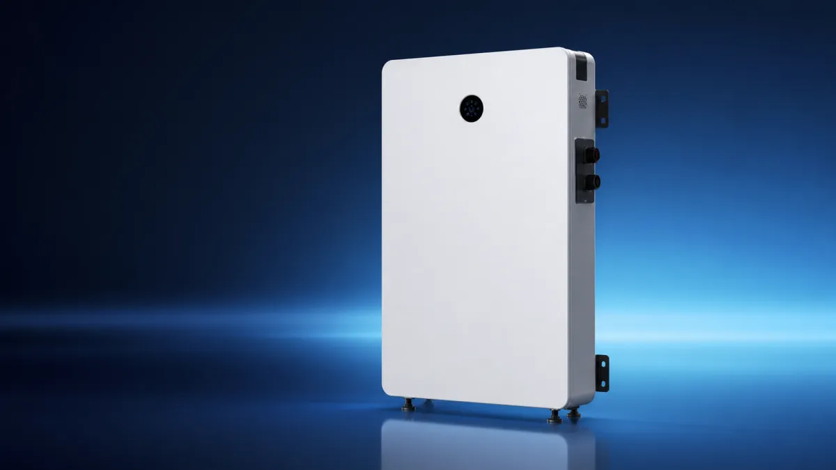
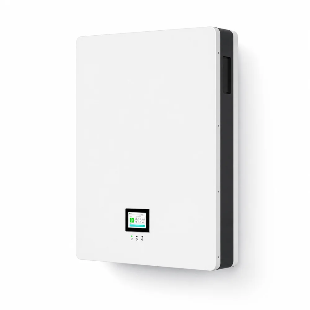
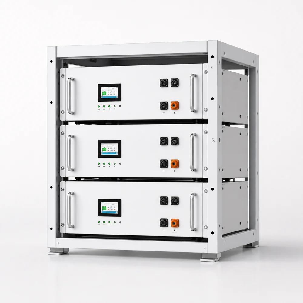
Batterie LFP 314 Ah – Montage mural à densité maximale de 16,08 kWh
Une armoire, 16,08 kWh, plus de 8 500 cycles. La solution à unité unique pour la sauvegarde de toute la maison et le stockage commercial léger où les modules 100 Ah ou 200 Ah empilés en parallèle gaspillent de l’espace mural.
51,2 VLFP

16,08 kWhPar unité

8,500+Cycles

Auto-chauffantCharge à froid
16,08 kWh par unité
Sauvegarde haute densité pour toute la maison dans une seule armoire, réduisant le nombre de modules de batterie parallèles sur le mur.
Plus de 8 500 cycles à 80 % de DoD
Conçu pour une longue durée de vie quotidienne, avec une note prudente pour la planification de projets de niveau installateur.
-20°C Auto-chauffant
Prise en charge intégrée de la charge à basse température pour les projets de stockage en montagne, dans le nord et dans les climats froids.
Installations réelles
314 Ah LFP sur le terrain
Armoires 314 Ah déployées sur le terrain dans le cadre de projets d’installation aux États-Unis, en Australie et en Europe — depuis la sauvegarde intérieure à armoire unique jusqu’aux systèmes parallèles extérieurs IP65 à plusieurs unités.
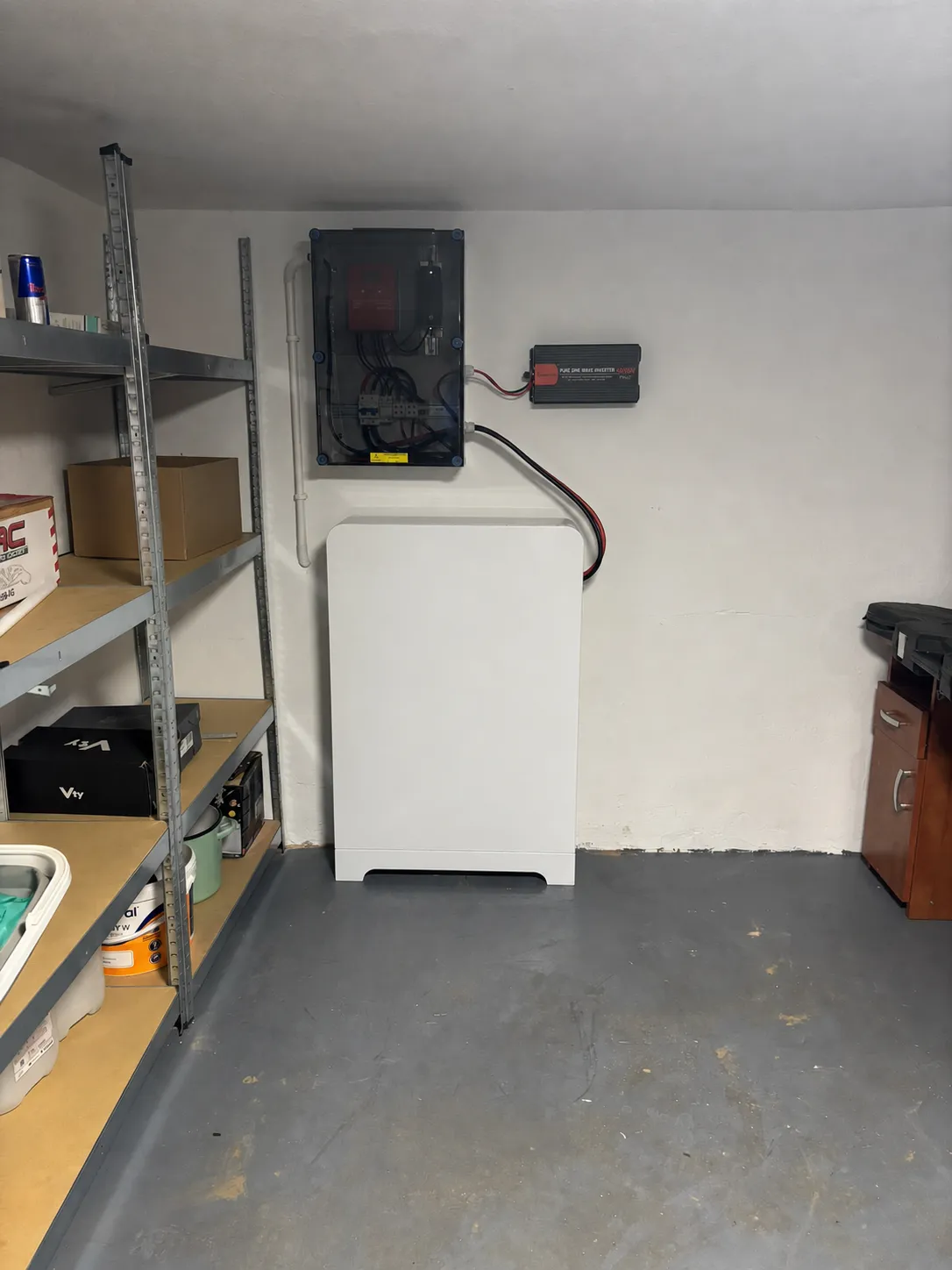
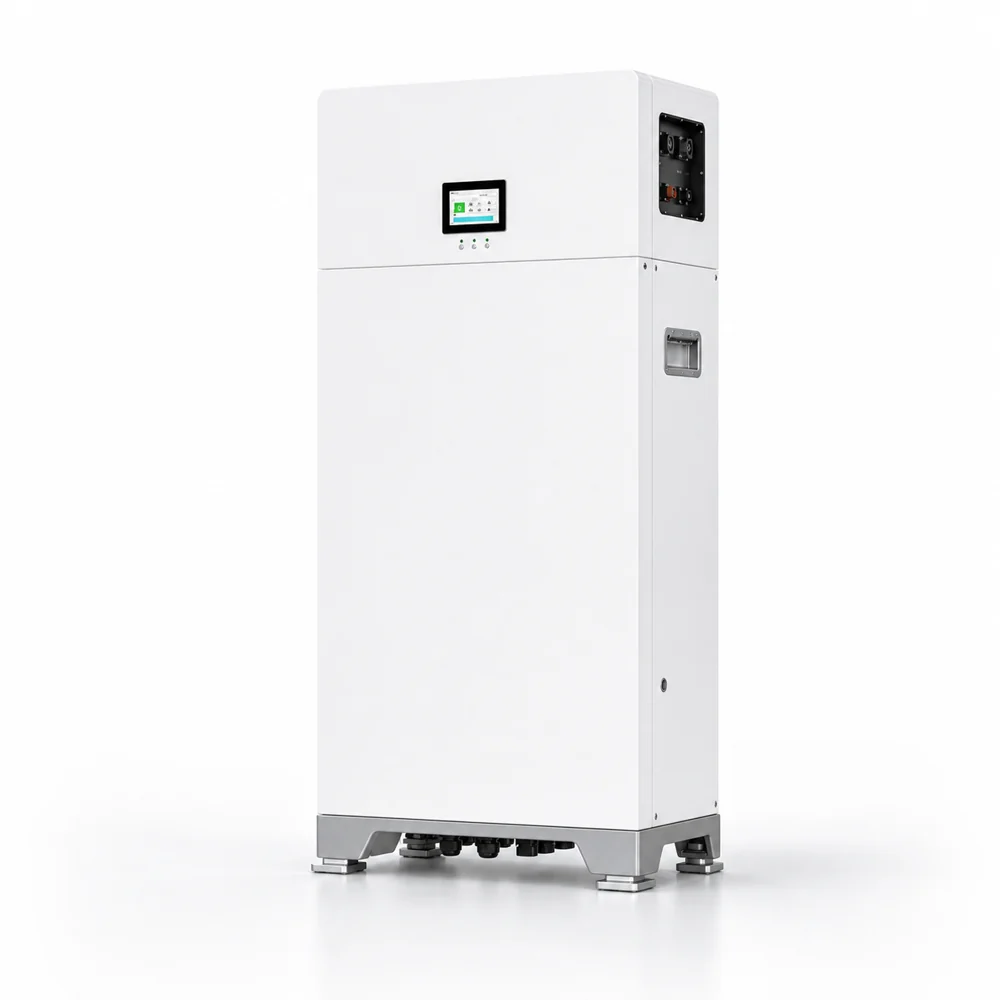
Armoire simple intérieure
Sauvegarde de garage de 16 kWh
Une armoire au sol de 314 Ah associée à un onduleur hybride mural : la configuration de sauvegarde pour toute la maison à armoire unique la plus propre.
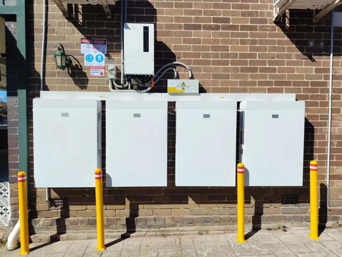
Multi-armoire IP65 extérieur
Parallèle extérieur à 4 unités
Quatre armoires IP65 installées en externe avec protection par borne. Une configuration de pipeline EPC typique pour les applications résidentielles ou commerciales légères à forte charge.
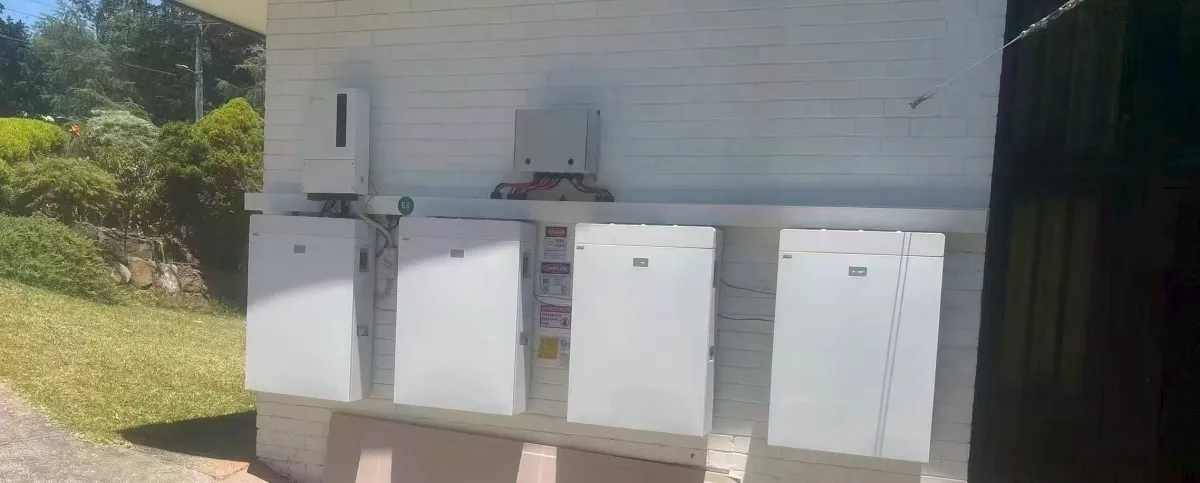
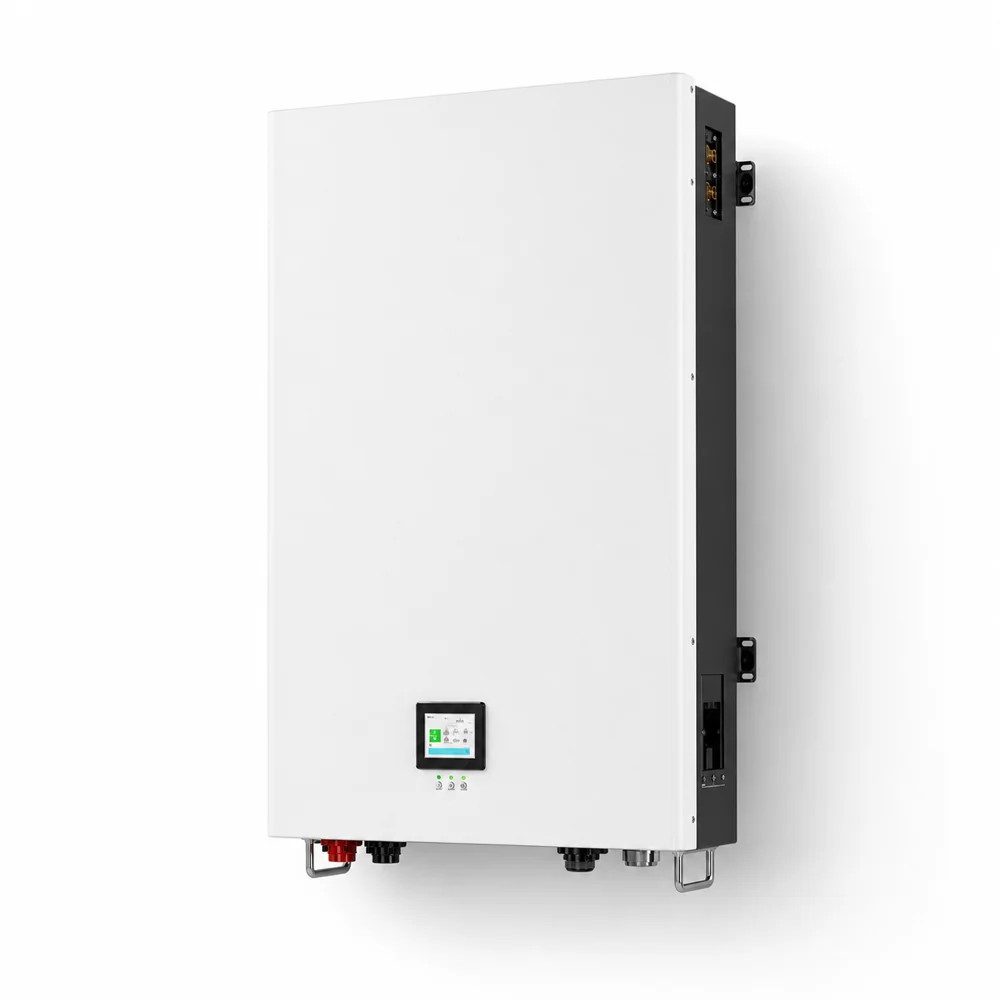
Système de montage mural
Couplage d’onduleurs hybrides
Banque de batteries LFP à montage mural associée à un onduleur hybride et à une communication par bus CAN standard — une installation résidentielle complète montrant l’intégration onduleur-batterie.
Gamme de produits
Comparez la gamme Savolture LFP
Même plate-forme LFP 48 V, quatre facteurs de forme : choisissez l’armoire qui correspond à votre installation, de 10 kWh à montage mural à 16 kWh au sol et modulaire en rack pour les banques commerciales.
Mural
200 Ah · 10,24 kWh
- Options IP20/IP65
- 6 500 cycles
- Classe 84,5 kg
Voir les détails de 200 Ah →
Mural
280 Ah · 14,34 kWh
- Chemin d’accès au système répertorié UL9540
- 8 500 cycles
- Classe 142,5 kg
Voir les détails de 280 Ah →
Vous êtes ici
Au sol
314 Ah · 16,08 kWh
- Chemin d’accès au système répertorié UL9540
- Option extérieure IP65
- Classe 145,5 kg
Configuration actuelle
Rack modulaire
Système de 10 à 15 kWh
- Compatible rack serveur 19 pouces
- Parcs de batteries modulaires
- Communication CAN/RS485
Afficher les détails du rack →
Avantage de densitéPourquoi 314Ah l’emporte sur les piles parallèles
La décision concernant une batterie de 16 kWh se situe rarement entre 314 Ah et « plus de modules de 100 Ah/200 Ah » : il s’agit de savoir si votre projet peut absorber le nombre d’armoires supplémentaires, les transferts BMS et la complexité du câblage. Pour un cadre de sélection de capacité plus large, consultez notre guide de sélection 100 Ah contre 200 Ah.
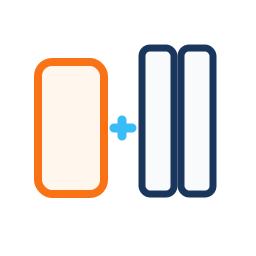
contre 3x 100Ah
Une armoire de 314 Ah remplace environ trois modules d’entrée, économisant ainsi de l’espace mural et simplifiant le transfert de la batterie.

contre 1,5x 200Ah
Évitez les travaux de câblage et de configuration parallèles supplémentaires lorsqu’une seule unité de 16 kWh correspond à l’objectif de charge du projet.

Densité LFP maximale
Environ 12 % de capacité en plus que 280 Ah et un niveau premium pratique pour le stockage résidentiel et commercial léger haut de gamme.
Spécifications techniques complètesDétails techniques de la batterie LFP 314 Ah
| Tension nominale | 51,2 V |
|---|
| Capacité | 314 Ah (16,08 kWh) |
|---|
| Chimie | LiFePO4 (LFP) |
|---|
| Configuration des cellules | 16 cellules prismatiques de 314 Ah (16S1P) — Pack nominal de 51,2 V 314 Ah, également référencé comme batterie 48 V 314 Ah dans la documentation de compatibilité de l’onduleur existant |
|---|
| Cycle de vie | Plus de 8 500 cycles à 80 % de DoD |
|---|
| Courant de charge maximum | 100A continu |
|---|
| Courant de décharge maximum | 200 A en continu (300 A en crête de 30 s) |
|---|
| Puissance de pointe | 10,24 kW en continu, 15 kW en pointe |
|---|
| Tension de charge | 56,8 V +/- 0,4 V (CC/CV à trois étages) — consultez le tableau de tension LiFePO4 48 V complet pour la corrélation SoC |
|---|
| Coupure de décharge | 40,0 V |
|---|
| GTC | 16S 3ème génération, équilibrage actif, auto-échauffement |
|---|
| Cuisinière auto-chauffante | -20°C à 0°C (auto-activé) |
|---|
| Température de fonctionnement | Décharge : -20°C à 60°C ; charge avec auto-chauffage : -20°C à 55°C |
|---|
| Température de stockage | -20°C à 45°C |
|---|
| Auto-décharge | <3% par mois à 25°C |
|---|
| Efficacité aller-retour | ≥95 % |
|---|
| Communications | CAN 2.0B 500 kbit/s / RS485 Modbus RTU / Ethernet |
|---|
| Type de montage | Support hybride mural ou au sol avec support configurable |
|---|
| Indice IP | IP20 intérieur (option IP54 extérieur) |
|---|
| Dimensions | ~925x460x245mm |
|---|
| Poids | 145,5 kg |
|---|
| Parallèle | Jusqu’à 16 unités (257 kWh max) |
|---|
| Garantie | 10 ans |
|---|
| Paramètre | Savolture 314Ah | EG4 314Ah | Pytes V16 | ÉCOLOGIQUE 314Ah |
|---|
| Capacité | 16,08 kWh | 16 kWh | 16 kWh | 16,07 kWh |
| Cycle de vie | Plus de 8 500 à 80 % de DoD | 10,000 | 6,000 | 6,000 |
| Décharge maximale | 200A | 200A | 200A | 150A |
| Puissance de pointe | 15 kW (30 s) | 12,8 kW | 13 kW | 12 kW |
| Auto-chauffant | Oui | Oui | Non | Non |
| UL9540 | Support documentaire | UL9540A disponible | Dépend du projet | Dépend du projet |
| Communications | CAN/RS485/Modbus/Ethernet | CAN/RS485/Ethernet | CAN / RS485 | RS485 |
| Parallèle maximum | 16 unités (257 kWh) | 16 | 16 | 16 |
| Garantie | 10 ans | 10 ans | 10 ans | 5 ans |
| Position de la chaîne | EPC + Distributeur | Vente au détail | Vente au détail | Vente au détail |
Les spécifications sont basées sur des informations de type fiche technique publique et sur des hypothèses de planification de projet. La tarification EPC pour les systèmes 314 Ah nécessite un devis logistique régional.
Ajustement du projetOù 16 kWh devient la bonne réponse
Que le projet nécessite une sauvegarde pour toute la maison, une résidence multifamiliale, un commerce léger ou un hors réseau pour climat froid, l’armoire de batterie de 16 kWh se situe à un point différent dans l’arbre de décision par rapport aux modules de 100 Ah ou de 200 Ah. Pour un contexte plus large en matière de classe de tension, lisez notre guide de tension 48 V contre 24 V contre 12 V ; pour les décisions relatives au contexte du réseau, voir hybride vs hors réseau vs lié au réseau.

Sauvegarde Premium pour toute la maison
Ciblez les maisons de 4 à 5 chambres avec des charges nocturnes plus importantes, une planification des pannes plus longues et une préférence du client pour une armoire de batterie propre.
Devis maison premium →

Résidentiel multifamilial
Utilisez une armoire haute densité par unité ou zone de service pour les appartements, les maisons en rangée et l’infrastructure de sauvegarde partagée.
Planifier un stockage multi-unités →

Pipeline commercial léger
Bureaux de soutien, cliniques, salles de télécommunications et projets de micro-réseaux nécessitant des blocs de batteries compacts de 48 V.
Créer un pipeline EPC →

Hors réseau pour climat froid
L’auto-chauffage protège la recharge à basse température dans les chalets de montagne, les maisons du nord et les sites hors réseau en haute altitude.
Taille de sauvegarde pour climat froid →
Technologie d’auto-chauffageChargement par temps froid sans devinettes
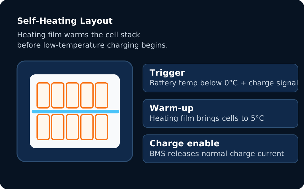
Pour les projets de 314 Ah dans les régions froides, le BMS et le film chauffant fonctionnent ensemble avant le début de la charge, réduisant ainsi les risques pour l’installateur et la confusion des clients.
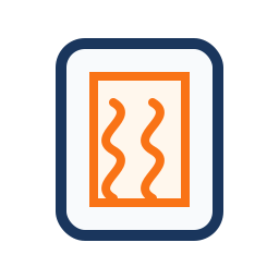
Disposition du film chauffant
Le film chauffant interne réchauffe la pile de cellules prismatiques avant que la charge à basse température ne soit libérée par le BMS.
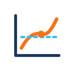
Courbe de température
Lorsque la température de la cellule est égale ou inférieure à 0 °C et qu’un signal de charge arrive, le chauffage démarre et cible une fenêtre de charge plus sûre. Pour connaître la relation température-performance complète, consultez les Plages de températures de fonctionnement LiFePO4.
Contrôle des charges
La charge est activée une fois que le pack atteint environ 5°C, de sorte que l’onduleur ne pousse pas de courant dans les cellules gelées.
Ajustement pour les régions froides
Conçu pour le nord des États-Unis, le Canada, l’Alaska, les régions de haute altitude et d’autres projets de stockage présentant un risque de charge hivernale.
Niveau d’onduleur PremiumOnduleurs 48 V compatibles pour les systèmes 314 Ah
Pour les systèmes 314 Ah, préférez les onduleurs hybrides d’une puissance nominale de 10 kW en continu ou plus pour utiliser pleinement la fenêtre de puissance de crête du pack 51,2 V 314 Ah. Pour connaître le côté onduleur correspondant de l’appairage, y compris la série d’onduleurs hybrides Savolture, lisez notre guide d’appairage onduleur hybride + batterie couvrant les quatre règles de dimensionnement dont chaque installateur a besoin.
 Schneider
 Victron
La compatibilité doit être vérifiée par rapport au micrologiciel de l’onduleur, au protocole de communication, aux exigences locales de l’AHJ et au schéma de câblage final. Pour connaître le dimensionnement des conducteurs à une décharge de 200 A, consultez le tableau des tailles des câbles de batterie 48 V.

Tarification des projets EPC
Niveaux de volume, options DDP US et planification des délais de livraison de 4 à 6 semaines pour les SKU de projets en stock.

Stockage des distributeurs
Tarification des palettes ou des conteneurs, assistance des revendeurs et packages de documentation pour les partenaires de distribution.

Image de marque personnalisée
Options en marque blanche et OEM pour les partenaires créant leur propre portefeuille de batteries régional.

Assistance directe sous garantie
Gestion des RMA conviviale, formation technique et assistance en matière de documentation de garantie.
314 Ah est-il une cellule unique ou une batterie complète ?
Il s’agit d’une batterie complète de 51,2 V construite à partir de seize cellules LFP prismatiques de 314 Ah en série, communément décrites comme une configuration 16S1P.
Pourquoi répertorier 8 500 cycles au lieu d’une allégation de 10 000 cycles ?
Savolture utilise un taux de cycle conservateur à une profondeur de décharge de 80 %. Les conditions de test, les seuils de fin de vie et les conditions de garantie varient selon la marque. La durée de vie réelle doit donc être comparée à la fiche technique complète et au langage de la garantie. Pour connaître les deux facteurs qui déterminent la durée de vie réelle, lisez combien de temps durent les batteries LiFePO4.
La batterie Savolture 314Ah prend-elle en charge l’auto-échauffement ?
Oui. Le film chauffant intégré est conçu pour s’activer automatiquement dans des conditions de charge à basse température, aidant ainsi le pack à passer à une fenêtre de charge plus sûre avant que le courant ne soit accepté.
Puis-je mettre en parallèle une armoire de 314 Ah avec un parc de batteries existant de 280 Ah ?
Ce n’est généralement pas recommandé. Mélanger les capacités des batteries peut créer un déséquilibre et un comportement incohérent en matière d’état de charge. La meilleure pratique consiste à utiliser des chaînes de batteries de capacité correspondante dans le même groupe.
La norme UL9540 est-elle répertoriée ou uniquement une prise en charge de la documentation ?
Les exigences de liste du système UL9540 dépendent de la configuration complète de la batterie et de l’onduleur. Les données de test UL9540A et la documentation au niveau cellule UL1973 peuvent prendre en charge l’examen AHJ tandis que la documentation complète du système est confirmée pour le projet.
Quelle est la tarification EPC pour les systèmes 314 Ah ?
Envoyez la capacité du projet, le modèle d’onduleur, la région d’expédition, le délai de livraison et les besoins en matière de marque. Savolture peut préparer un devis DDP basé sur le volume avec des détails sur le transport et la documentation pour examen par EPC ou par le distributeur.
De combien d’unités 314 Ah ai-je besoin pour mon projet ?
Un 314 Ah couvre une maison américaine typique de 3 chambres avec une autonomie de 2 jours (~ 30 kWh/jour). Pour les maisons plus grandes ou pour la recharge des véhicules électriques, vous aurez peut-être besoin de 2 à 3 unités en parallèle. Exécutez vos charges via notre calculateur de dimensionnement pour une recommandation exacte du nombre d’unités.
Devis de systèmes 314 Ah pour votre pipeline de projets
Envoyez les spécifications de votre projet (capacité, onduleur, région et délai de livraison) et recevez un devis de qualité EPC avec options de transport, de documentation et de formation des installateurs dans les 24 heures.
{“@context”:”https://schema.org”,”@graph”:[{“@type”:”Product”,”@id”:”https://savolture.com/fr/products/314ah-lfp-battery/#webpage”,”url”:”https://savolture.com/fr/products/314ah-lfp-battery/”,”name”:”Batterie LFP 314 Ah – Montage mural à densité maximale de 16,08 kWh”,”description”:”Batterie LFP 314 Ah – Montage mural à densité maximale de 16,08 kWh : documentation technique et approvisionnement direct d’usine de batteries LiFePO4 pour installateurs et distributeurs.”,”inLanguage”:”fr”,”author”:{“@id”:”https://savolture.com/#organization”},”publisher”:{“@id”:”https://savolture.com/#organization”}},{“@type”:”Organization”,”@id”:”https://savolture.com/#organization”,”name”:”Savolture”,”url”:”https://savolture.com/”,”inLanguage”:”fr”}]}